You may have observed an omnipresent company logo in many slides That raises a question: do you really need to have
a company logo on all your slides? First, it takes a fair amount of space. Secondly, the audience knows which company the speaker
belongs to since that information is almost always placed on the first slide. Also speakers do introduce themselves and their
companies. So, do all slides need that extra branding? All these questions are fair, and there are equally fair answers for them.
You should certainly add a company logo to your first slide, and then place a more subtle or watermarked logo on the rest of the
slides, or even no logo at all. Fortunately, PowerPoint makes it easy to add a logo to all your slides, and then you can
make it sure that some slides have no logo at all or even a more understated version of the logo.
Before you begin, you must get your logo in a graphic file format that PowerPoint can understand. It's always better to work
with a vector file format such as EMF or WMF rather than the bitmap file formats that PowerPoint supports.
Additionally, make sure that you have two versions of the logo: one should be the regular, prominent logo used company-wide.
Additionally, make sure you have a more subtle version of the logo that does not stand out. Look at Figure 1
below, where the Indezine logo on the left is prominent enough to stand out. The same logo towards the right has less saturated
colors, and will fade well with the background so that your other slide content can get the attention it deserves.

Figure 1: The Indezine logo with both a prominent and a subtle look
Note: Most company logos are in either Adobe Illustrator's AI or EPS file formats. These are the industry
standards and most logo designers and in-house graphic designers will certainly have a copy of your company logo in these file
formats. Unfortunately, both these file formats are not PowerPoint friendly. Although PowerPoint can insert EPS files, more often
than not, the results can be unpredictable. Ask your design team to export the logo files to EMF from within their dedicated
graphic program. Also, ensure that you get both the regular and subtle versions of the logo.
Follow these steps to learn how you can add these logos to your Slide Master in
PowerPoint 2013:
- Launch PowerPoint, and access the View tab of the
Ribbon. Click the Slide Master button,
as shown highlighted in red within Figure 2.

Figure 2: Slide Master button- This opens the Slide Master
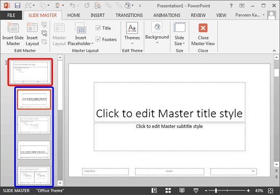
View, as shown in Figure 3. Here, within the pane on the left, you'll find one large slide thumbnail that
represents the Slide Master (highlighted in red within Figure 3),
and several smaller slide thumbnails below representing individual
Slide Layouts (highlighted in
blue within Figure 3). To add a logo or a graphic to your entire
presentation (including all Slide Layouts within the hierarchy), you need to select the
Slide Master.

Figure 3: Slide Master view- With your Slide Master selected, insert your logo. Choose the subtle version of the logo. Since
a logo is a picture file, you place it in the same way as you
insert a picture. By default, PowerPoint
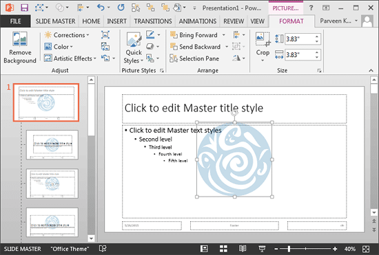
places the logo right in the center of your Slide Master, as shown in Figure 4, below. Also notice that the logo
shows up within all the Slide Layouts (refer to the Slides pane on the left in Figure 4,
below).

Figure 4: Logo inserted within the Slide Master and Slide Layouts- Now you can
resize and
reposition the logo to an appropriate location on your
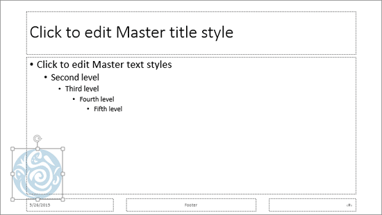
Slide Master. As you can see in Figure 5 below, we resized the logo and placed it at the
bottom left of the Slide Master.

Figure 5: Logo resized and repositioned- Right-click the logo, and from the contextual menu that appears choose the Send to Back |
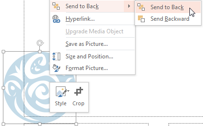
Send to Back option, as shown in Figure 6, below. You need to do so because all slide content
within placeholders need to be above the logo.

Figure 6: Send to Back option- Now you can hide the logo from some individual Slide Layouts. You do so for two reasons: firstly,
you may want a clean slide without a logo for some Slide Layouts. Typically, the
Blank and Title Only layouts are good candidates for removing the logo altogether. Additionally,
you may want the prominent version of your logo for the Title Layout. To do so, you first need to hide the
subtle version of the logo we just added to the Slide Master.
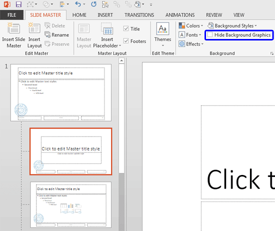
- Select the Title Layout (or any other layout) as shown in Figure 7, below.
Then access the Slide Master tab of the Ribbon, and select the
Hide Background Graphics check-box, as shown highlighted in red within
Figure 7. The Hide Background Graphics check-box shown in Figure 7 is not
selected; you just need to click on the check-box to see a right mark on it which indicates its selected status.

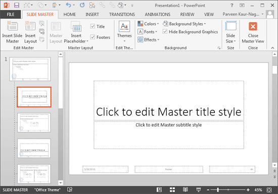
Figure 7: Hide Background Graphics check-box to be selected- This action will hide the subtle logo from your Title Layout, as shown in
Figure 8.

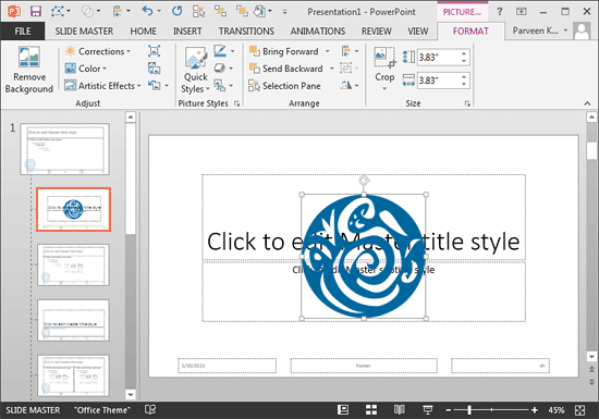
Figure 8: Logo hidden from Title Layout- Now, to add the prominent variation of the logo, select the Title Layout and
insert the logo (picture). By default, this
logo is also placed right in the center of your Title Layout, as shown in Figure 9, below. Also
notice that the logo shows up only within the Title Layout (refer to the Slides pane on the left in
Figure 9, below). You'll notice that this prominent logo does not show up within the
Slide Master or even the other Slide Layouts.

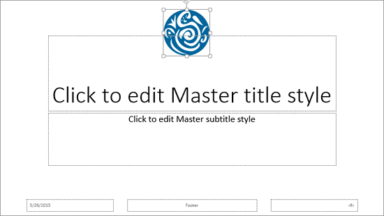
Figure 9: Prominent version of logo added within the Title Layout- We resized and
repositioned the logo to an appropriate location on
the Title Layout, as you can see in Figure 10, below. Finally, right-click the logo, and choose
the Send to Back | Send to Back option from the contextual menu (refer to
Figure 6, shown earlier on this page).

Figure 10: Logo resized and repositioned- Similarly, you can choose individual slide layouts and select the Hide Background Graphics
check-box to hide the logo or any other inserted graphic from that particular layout. When done, access the
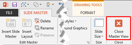
Slide Master tab of the Ribbon, and click the Close Master View
button (highlighted in red within Figure 11). This will get you back to
Normal View.

Figure 11: Close Master View button- Access the Home tab of the Ribbon and, click the Layout button
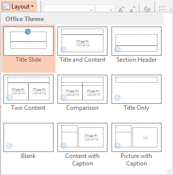
to bring up the Layout drop-down gallery you see in Figure 12, below. Notice that except the
Title Layout, which has the prominent logo, the subtle logo is visible in all the other layouts.

Figure 12: Slide Layouts with the logo added- Save your presentation often.


