Although the default fill and border (outline) that PowerPoint 2007 applies to charts may be perfectly adequate, you might want to play with the Chart Styles found in the Chart Tools Design tab of the Ribbon. All these Styles are based on the Office Theme you have applied to the active presentation. While this works great most of the time, there will be occasions when you may want to use a color for any of your data series that's not part of the Theme palette in your presentation. In times like these, you can control the fill and border of chart elements using the techniques explained on this page.
Before you get started with this tutorial, we suggest you have a chart inserted on your PowerPoint slide. We used a column chart for this example, but you can use some other chart type. Elsewhere on this site, you'll find individual tutorial pages that show you how you can insert a chart in PowerPoint 2007, and how you can change the chart type from one to another. Now let's go ahead and customize the look of the chart by changing the fill and the border characteristics.
Note: PowerPoint 2007 uses the terms border and outline interchangeably to mean the same thing, i.e. the perimeter line around a chart element!
Follow these steps to learn more:
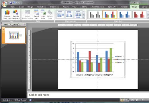
- Selecting the chart on your slide will bring up the three Chart Tools tabs in the Ribbon area, as shown in Figure 1. We'll explore the Chart Tools Layout tab later in this tutorial.

Figure 1: Selected Chart Note: The
Chart Tools Design,
Layout, and
Format tabs are
contextual tabs. These tabs are special tabs in the
Ribbon that are not visible all the time. They only make an appearance when you are working with a particular slide object which can be edited using special options.
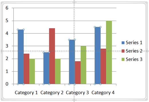
- Now, click on the chart element, for which you want to change the fill and border. Alternatively, you can select any chart element from the Chart Tools Layout tab of the Ribbon. For this tutorial, we have chosen the first set of columns from the left that represents the first data series in this chart (see Figure 2).

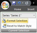
Figure 2: Selected chart element - Activate the Chart Tools Layout tab of the Ribbon. Towards the extreme left of the Ribbon tab, make sure that you have the correct data series selected, then click the Format Selection button (see Figure 3).

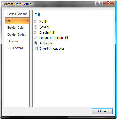
Figure 3: Format Selection - This summons the Format Data Series dialog box, as shown in Figure 4.

Figure 4: Format Data Series - Within the Format Data Series dialog box, select the Fill tab on the left pane. The right pane then shows the Fill options, as explained below:
No fill
- Removes any fill from the selected column(s).
Solid fill
- Provides a solid fill color. Selecting this radio option provides some more options within this dialog box to choose a solid fill color from Theme colors, Standard colors, etc. This tutorial on adding solid fills to shapes discusses this concept in detail.
Gradient fill
- Allows you to add graduated fills comprising two or more colors. This tutorial on adding gradient fills to shapes explains more.
Picture or Texture fill
- Adds a texture or picture as a fill for the selected column(s). This tutorial on texture fills for shapes provides more information.
Automatic
- Takes the default fill color, based on the current theme.
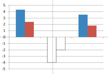
Invert if Negative
- This works if you have any negative figures in your chart. Any such figures show as data series below the horizontal axis in another color (see Figure 5).

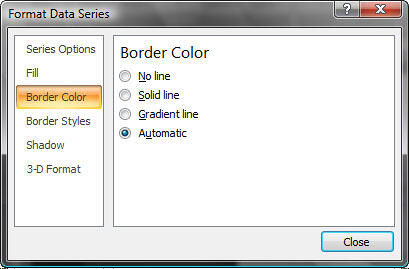
Figure 5: Invert if negative - Now in Format Data Series dialog box, select the Border Color tab in the left pane (see Figure 6). This brings up options for formatting the border in the right pane.

Figure 6: Border Color - Options in the Border Color tab are explained below:
No line
- Removes borders from any selected column(s).
Solid line
- Provides a solid color border to the selected column(s), these colors can be Theme colors, Standard colors, etc. Learn more in this page that looks at formatting shape outlines.
Gradient line
- Applies graduated lines that are composed of two or more colors. Learn more about gradient outlines for shapes.
Automatic
- Takes the default line color, based on the current theme.
- Once all changes have been done, click Close to get back to the chart.
- Save your presentation.
