Data labels in charts are used to display the value, or the name of the chart series, or categories right above or next to the series on the chart. Adding data labels can help the presenter reveal exact values along with the series, so that he or she need not check on the Y axis to ascertain approximate values of any series.
In this tutorial, let us learn how to add data labels in a chart. To begin, you need to insert a chart on your slide. You can also change the chart type from one to another. Then, follow these steps to add data labels in PowerPoint 2011 for Mac:
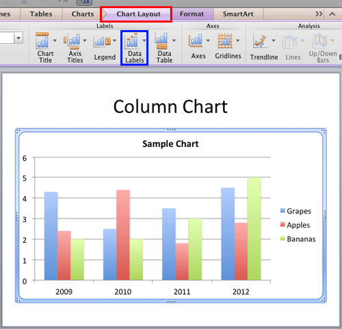
- Select the chart on your slide as shown in Figure 1, below. This step displays the Chart Layout and Format tabs on the Ribbon area. Select the Chart Layout tab, as shown highlighted in red within Figure 1. Within the Chart Layout tab, click the Data Labels button, highlighted in blue within Figure 1.

Figure 1: Chart Layout tab selected Note: The
Chart Layout tab is a
Contextual tab. These tabs are special tabs in the
Ribbon that are not visible all the time. They only make an appearance when you are working with a particular slide object which can be edited using special options.
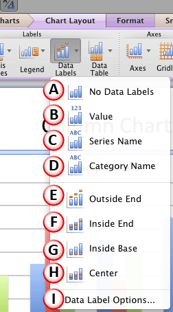
- Doing so opens the Data Labels drop-down gallery, as shown in Figure 2, below.

Figure 2: Data Labels drop-down gallery - Among the options within the Data Labels drop-down gallery, options marked as B to D within Figure 2, above determine the type of the data labels, whereas the options E to H determine their positions. Let us explore options within the Data Labels menu as marked in Figure 2, above:
A. No Data Labels
- This option, selected by default ensures that no data labels appear on the chart as shown in Figure 1, above.
B. Value
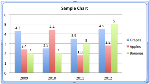
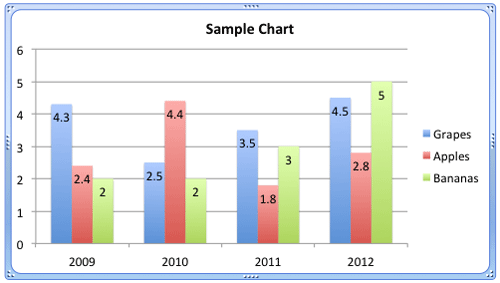
- Selecting this option displays values of series as data labels as shown in Figure 3, below. By default, values (or any other type of data labels explained later on this page in points B to D) are placed at the Outside End (on top for Column charts) of the series, as shown in Figure 3. You can reposition them using any of the options E to H explained later on this page.

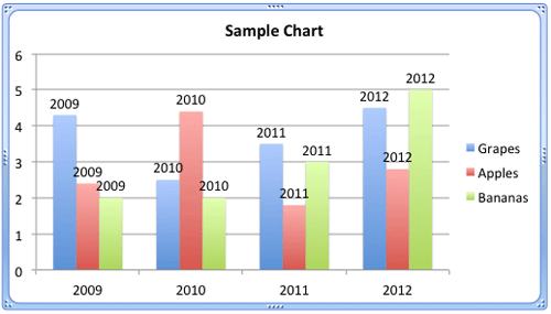
Figure 3: Values displayed as data labels C. Series Name
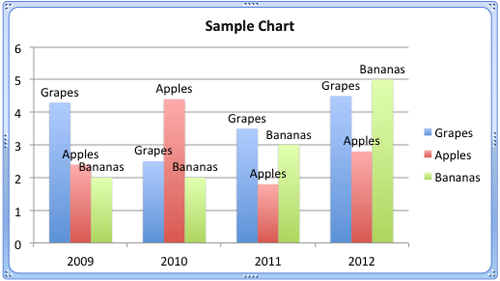
- Displays the names of the series as data labels as shown in Figure 4, below.

Figure 4: Series Names displayed as data labels D. Category Name
- Displays the names of the categories as data labels as shown in Figure 5, below.

Figure 5: Category Names displayed as data labels E. Outside End
- Places the data labels at the top of each series as shown in Figure 3, 4, and 5, as shown previously on this page.
F. Inside End
- When you select this option the data labels are placed overlapping the series at the top area, as shown in Figure 6, below.

Figure 6: Position of data labels when Inside End option is selected G. Inside Base
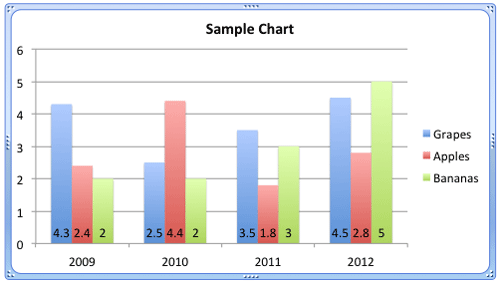
- When you select this option the data labels are placed overlapping the series at the bottom area, as shown in Figure 7, below.

Figure 7: Position of data labels when Inside Base option is selected H. Center
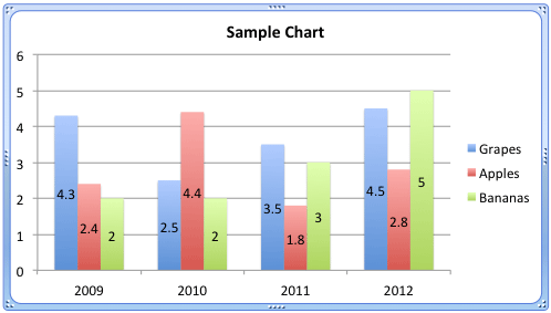
- When you select this option the data labels are placed overlapping the series at the center, as shown in Figure 8, below.

Figure 8: Position of data labels when Center option is selected I. Data Label Options
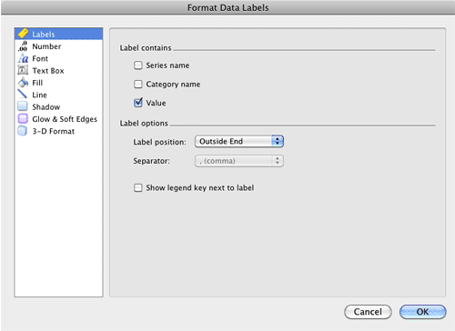
- Summons the Format Data Labels dialog box that provides the options to format data labels as shown in Figure 9, below.

Figure 9: Format Data Labels dialog box - The options within the Format Data Labels dialog box are explained in our following tutorials:
- Chart Data Labels - Format Labels Options
Chart Data Labels - Format Number Options in Excel
Chart Data Labels - Format Number Options in PowerPoint
Chart Data Labels - Other Options
- Select the data label options as required. Save your presentation.
