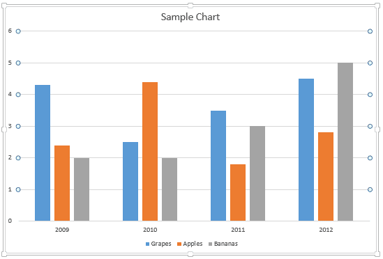
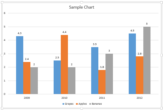
In a PowerPoint chart, data labels are used to display various types of information. You can display the value, and/or the name of the chart series, and/or the categories right within or above the series on the chart. Adding data labels can help the presenter reveal exact values along with the series, so that he or she need not check on the Value axis to ascertain approximate values of any series. In a default PowerPoint chart, you won't be able to see the data labels enabled, as shown in Figure 1, below.

Figure 1: Data Labels are not visible by default in a PowerPoint chart
In this tutorial, let us learn how to add data labels to a chart. To begin, you need a chart inserted and selected as shown in Figure 1, above. Then follow these steps in PowerPoint 2013 for Windows:
- Select the chart on your slide as shown in Figure 1, above. This brings up two Charts Tools contextual tabs of the Ribbon. Select the Design tab, highlighted in red within Figure 2, below. Then, click the Add Chart Element button, shown highlighted in blue within Figure 2. Doing so opens a drop-down gallery as shown in Figure 2. Within this drop-down gallery, select the Data Labels option to open a sub-gallery which includes various options for the data labels, as shown highlighted in green within Figure 2.

Figure 2: Data Labels sub-gallery Note: The
Chart Layout tab is a
Contextual tab. These tabs are special tabs in the
Ribbon that are not visible all the time. They only make an appearance when you are working with a particular slide object which can be edited using special options.
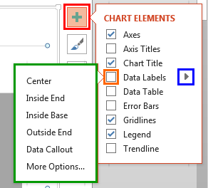
- Alternatively, you can select the chart and click the Chart Elements button (the plus sign highlighted in red within Figure 3). Doing so opens the Chart Elements gallery. Within the Chart Elements gallery, hover your cursor over the Data Labels option. This action brings up a right-arrow as shown highlighted in blue within Figure 3. Click this right-arrow to open the Data Labels sub-gallery, as shown highlighted in green within Figure 3, below, which includes various options for the data labels.

Figure 3: Data Labels options - Both Data Labels sub galleries shown in Figures 2 and 3 offer almost the options, except that the latter gallery does not provide the None option. However, if the check box next to the Data Labels option is not selected, as shown highlighted in orange within Figure 3, then, that is equal to selecting the None option.
- Let us now explore options within the Data Labels sub-galleries:
A. None
- Selected by default, this option removes any existing data labels from the chart. Your chart may appear like what you saw in Figure 1, shown previously on this page.
B. Center
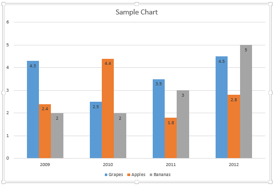
- When you select this option, data labels are placed in such a position that they overlap the series at the center, as shown in Figure 4, below.

Figure 4: Position of data labels when Center option is selected C. Inside End
- When you select this option, data labels are placed overlapping the series at the top area, as shown in Figure 5, below.

Figure 5: Position of data labels when Inside End option is selected D. Inside Base
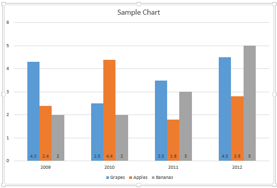
- When you select this option, data labels overlap the series at the bottom area, as shown in Figure 6, below.

Figure 6: Position of data labels when Inside Base option is selected E. Outside End
- Places data labels at the top of each series, as shown in Figure 7, below.

Figure 7: Position of data labels when Outside End option is selected F. Data Callout
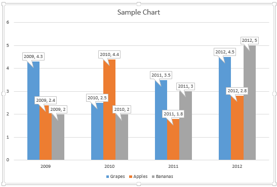
- Places data labels at the top of each series and adds a rectangular callout around each of them, as shown in Figure 8, below. This is a new option in PowerPoint 2013 for Windows. Learn more about this option in our Chart Data Callouts in PowerPoint 2013 for Windows tutorial. You can also change the shape of the data callout from a simple rectangle to any other shape as explained in our Change Callout Shapes for Data Labels in PowerPoint 2013 for Windows tutorial.

Figure 8: Data callouts added G. More Data Label Options (More Options)
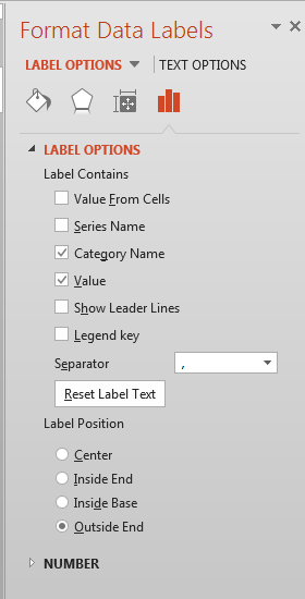
- Summons the Format Data Labels Task Pane that provides you with various options to customize the appearance of your data labels, as shown in Figure 9, below. Options within this Task Pane are explained in our Format Data Label Options for Charts in PowerPoint 2013 for Windows tutorial.

Figure 9: Format Data Labels Task Pane - Select the data label options as required to add Data Labels to your chart.
- Save your presentation.
