Charts in PowerPoint comprise several individual components that are called Chart Elements. Some of these elements are:
- Series (and this could be one or more series with values)
- Categories (again this can be one or more categories)
- Axes (horizontal, vertical, and in some chart types, a third axis as well)
- Plot area (the active chart area)
- Legend
- Chart Title
- And many more...
In this tutorial, we'll learn more about these individual chart elements. Before starting, we assume you already have a chart inserted on a PowerPoint slide. If not, learn how you can place a new chart on a slide in PowerPoint 2011 for Mac.
Selecting Chart Elements
Follow these steps to select individual chart elements in PowerPoint 2011 for Mac:
- Select the chart as shown in Figure 1. This will make two new tabs, Chart Layout and Format visible on the Ribbon. As you can see in Figure 1, their color is different from that of other Ribbon tabs.

Figure 1: Chart selected - Note: The Chart Layout and Format tabs are Contextual tabs. These tabs are special tabs in the Ribbon that are not visible all the time. They only make an appearance when you are working with a particular slide object which can be edited using special options.
- You can directly click on any individual chart element within the chart itself to select it, such as Plot Area, Columns, Legend, etc. However, with so many chart elements close to each other, and sometime overlapping each other, it's easier to use another selection process, as explained next.
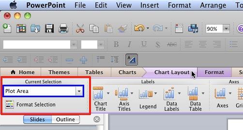
- Select either the Chart Layout or the Format tab of the Ribbon. Both of these tabs include the Current Selection group that you can see highlighted in red within Figure 2. As you can see, the Plot Area is the active chart element selected currently.

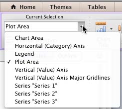
Figure 2: Current Selection group within the Chart Layout tab of the Ribbon - Within the Current Selection group, click the down-arrow button that you can see highlighted in blue within Figure 2 above. This will reveal a listing of all chart elements in the active chart, as shown in Figure 3, below. Any individual element that is selected has a check mark placed in front of it. As you can see in Figure 3, the Plot Area is the current active element. Active elements are simultaneously selected within your chart as well.

Figure 3: List of Chart Elements to be selected - Note: Figure 3 displays the chart elements for a typical Column chart, if your chart type is different, you will see different chart elements.
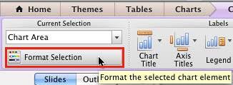
- Now go ahead and select the chart element you want to format. As you can see in Figure 4, we have selected the Chart Area in the Current Selection drop-down list. Once you have selected any of the elements in the drop-down list, click the Format Selection button right below the same drop-down, as shown highlighted in red within Figure 4.

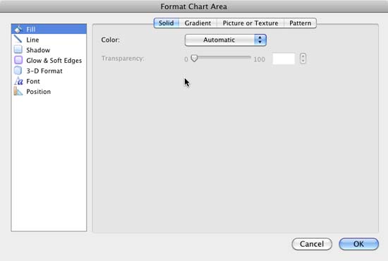
Figure 4: Format Selection button - Choosing the Format Selection button brings up the Format Chart Area dialog box, as shown in Figure 5. If you had some other chart element selected instead of Chart Area, the dialog box that you would end up with would provide options pertaining to your selection. So, this is all very logical and intuitive.

Figure 5: Format Chart Area dialog box - Format the chart area (or another chart element you may have selected) as required, and then click OK to apply the changes and get back to your chart. You can similarly select any other chart element, and format its properties as required.
- Save your presentation often.
Back
Chart Elements
Although different charts have differing chart elements, these are the common chart elememts found in most chart types:
- Axes: Most charts have two axes:
- The bottom, horizontal axis (X axis), and
- The left, vertical axis (Y axis)
- Some charts may also have a Z axis, or even multiple X or Y axes. Learn more about PowerPoint's chart axes.
- Plot Area: The area within the axes is known as the plot area. The plot area includes the series, gridlines, etc. And the legend and titles are normally placed outside the plot area.
- Gridlines: Most of the time, you may see horizontal gridlines but vertical gridlines are also available, and both of them can be formatted as required.
- Titles: There are two types of titles:
- Datasheet mode: Getting into datasheet mode in PowerPoint 2011 translates to launching Microsoft Excel with your data available to edit, add, remove, etc. This Excel sheet contains the values based on which the chart is created. In case you find yourself in a rare situation where you have PowerPoint 2011 installed without Excel 2011 (also Excel 2008), then you'll see the regular Microsoft Graph datasheet that was the norm in the days of PowerPoint 2004 and previous versions.
- Series: Every column of data within the data that's shown as a component of the chart is known as a Series.
- Categories: A set of Series can be represented as a Category.
- Values: These are the individual figures that identify each series. The font and placement for these can be formatted.
- Legends: This is a box placed normally outside the plot area which provides captions (and/or color coding) to the series, and helps identifying the series. Legends are automatically created with the chart itself, although you can opt to remove the legend.

