Learn how to add and reposition chart legends in PowerPoint 2011 for Mac. Experiment with different legend positions to find the one that works best for you.
Author: Geetesh Bajaj
Product/Version: PowerPoint 2011 for Mac
OS: Mac OS X
Charts in PowerPoint can be made to look different and unique by changing the appearance of various chart elements. The legend is an important chart element, typically the legend is a box or area that codes via color or pattern to all the chart series. Figure 1, below shows a default column chart in PowerPoint 2011 for Mac.
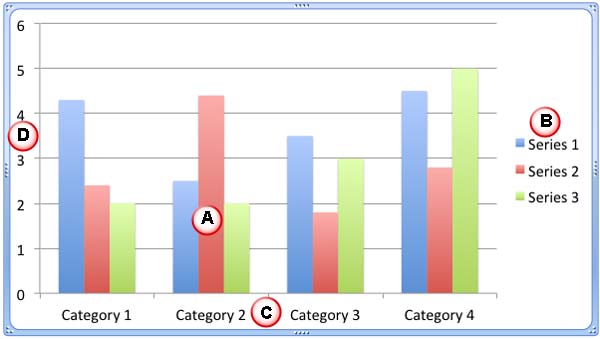
Figure 1: Basic chart elements
The basic elements of this chart, as marked above are:
The legend is the box that captions the series: Series 1, Series 2, and Series 3 and identifies them with different colors so that you can follow which series each of the columns in that chart belong to. By default, the legend appears on the right side of the chart as shown in Figure 1, above.
The legend can be formatted to be placed at various locations within the chart area, and you can also hide it altogether.
Follow these steps to learn more about the chart legend in PowerPoint 2011 for Mac:
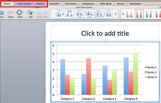
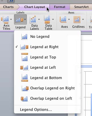
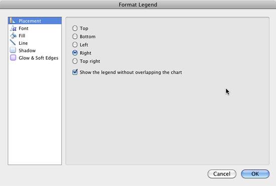
Want to quickly change the look of your chart? Do explore Chart Styles.
Here is a sample presentation of legend positions in PowerPoint 2011 for Mac:
Click below to view on Slideshare
See Also:
Chart Legend: Chart Legend (Glossary Page)
Chart Legend in PowerPoint 2013 for Windows
Chart Legend in PowerPoint 2010 for Windows
Chart Legend in PowerPoint 2007 for Windows
Chart Legend in PowerPoint 2003 for Windows
You May Also Like: How to End Your Online Presentation or In-Person Speech With Impact | Stock Market PowerPoint Templates


Microsoft and the Office logo are trademarks or registered trademarks of Microsoft Corporation in the United States and/or other countries.