Apply predefined Chart Styles to your charts in PowerPoint 2013 for Windows. With one click, predefined combinations of various chart elements can be easily applied.
Author: Geetesh Bajaj
Product/Version: PowerPoint 2013 for Windows
OS: Microsoft Windows 7 and higher
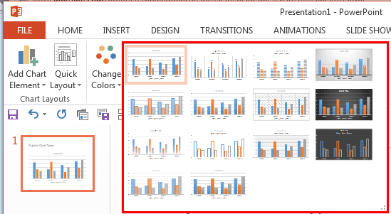
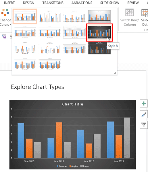
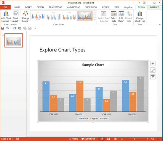
Making a chart look different involves so much because each chart has almost 10 or more elements that contribute to its appearance. If you start formatting all these 10 elements individually, it will take a long time to get results. And the same attributes will be difficult to apply to any other chart within the same presentation. The saviour in this case can be the amazing Chart Styles option in PowerPoint 2013. These Chart Styles include predefined combinations for various chart elements and include effects and layouts that can change the look of your chart completely. And, all these styles are based on Office Themes. Just a couple of clicks can make your charts look distinctive.
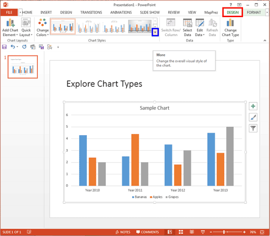
To apply a Chart Style, you first need to have a chart in your presentation. Learn how to insert a chart in PowerPoint 2013, and then follow these steps to apply a chart style in PowerPoint 2013 for Windows:


See Also:
Chart Basics: Chart Styles (Glossary Page)
Chart Styles in PowerPoint 2016 for Windows
Chart Styles in PowerPoint 2011 for Mac
Chart Styles in PowerPoint 2010 for Windows
Chart Styles in PowerPoint 2007 for Windows
You May Also Like: How to Prevent Your Online Audience from Getting Distracted | Zimbabwe Flags and Maps PowerPoint Templates


Microsoft and the Office logo are trademarks or registered trademarks of Microsoft Corporation in the United States and/or other countries.