Indezine Logo


PowerPoint Chart Tips 01: Clean Charts

The first tip is to create clean charts in PowerPoint. This entire series is also available in the form of an ebook.


Author:

Product/Version: PowerPoint

OS: Microsoft Windows and Mac OS X


Learn PowerPoint

How to manage multiple versions of PowerPoint on the same machine?


The biggest bane of charts seen on PowerPoint slides is that they are too crowded, include too much detail that's much more than what audiences want, and contain so little white space. By white space, we don't just mean space that is colored white—rather, we mean empty, breathing space. If we had to sum up what we need in two words, then those two words would be "clean charts."

To bring attention to what a clean chart is, we must first look at a chart that is not clean! Look at Figure 1, below, where you can see a moderately ineffective chart. Why do we call this a moderately ineffective chart? That’s because we have seen charts that are so much worse than this specimen.
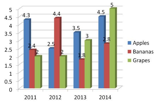
A moderately bad chart
Figure 1: A moderately bad chart

If we just follow a few guidelines and five minutes of effort, the same chart you saw earlier can be transformed into what you see in Figure 2, below.
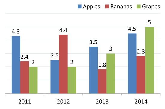
A better chart
Figure 2: A better chart

There’s such a huge difference between the charts you see in Figures 1 and 2. First of all, we abandoned the 3D chart type in favor of a cleaner, flat look. We also removed the value axis altogether since we already have data labels. It makes no sense to include individual data labels and then also provide a value axis, since that’s essentially duplicated information. We moved the legend to the top right so as to give more white space in between the column groups. Finally, we reduced the opacity of gridlines to make them less prominent.

Whenever possible, try to make your charts clean. Here are some guidelines that will help you:

  • Imagine a clean, harmonious background for your slide that you don't want to crowd. This approach will make it easier for your chart to stand out, resulting in the audience being able to review the chart more attentively.
  • Have you ever tried doing a very important project on a very cluttered desk? Chances are you realized that a clean desk can help you create a better project because you can concentrate more. It's the same with the audience, they can assimilate information presented on a slide better if it contains a clean chart on an uncluttered background.
  • To create a clean chart, retain only the chart elements that are needed. Yes, you must add the actual chart but not much else.
  • You don't always need a legend, data labels, axes labels, titles, plot lines, too much data, or even too much extra text. And you most certainly do not need them all at the same time! Limit yourself to the fewest number of chart elements as you can.
  • Some slides have many charts. Even four charts in a single slide may be too many, but we have seen slides that had sixteen charts! If your audience cannot decipher the chart content at such a small size, is there any sense in following this approach? Think about it!

10 14 02 - Ten Tips for Cool PowerPoint Charts: PowerPoint Chart Tips 01: Clean Charts (Glossary Page)

You May Also Like: Presentation Management is Better Content Management | Snapdragon PowerPoint Templates


Popular Posts

Shapes
Shapes
Learn how you can create and manipulate shapes in PowerPoint -- knowledge of working with shapes is significant because they are the building blocks of creativity in PowerPoint.

Insert Picture from the Office ClipArt Collection in PowerPoint 2013
Learn how to insert picture using Office ClipArt in PowerPoint 2013.

Snow Effect in PowerPoint
Create a snow fall effect inside PowerPoint using animation techniques.

PowerPoint Transitions: Curtains
Explore the Curtains transition effect in PowerPoint.


Feature List 01 (Layout with Tabs)

The Feature List Layout comprises three sample PowerPoint presentations: one each to create a visual list for 4 features, 5 features, and 6 features. These work great when you have too much information to fit within one slide. This solution lets you use multiple slides, but the visual result is still that of one single slide!

Buy and Download Feature List 01 (Layout with Tabs) for $4.99+ (671 kb)


Microsoft and the Office logo are trademarks or registered trademarks of Microsoft Corporation in the United States and/or other countries.

Home | PowerPoint | Photoshop | PowerPoint Templates | PowerPoint Tutorials | Blog | Notes | Ezine | Media Kit | Feedback | Site Map | About Us | Contact Us

Link to Us | Privacy | Testimonials

PowerPoint Backgrounds | Christian PowerPoint Backgrounds | Business PowerPoint Presentation Templates

Plagiarism will be detected by Copyscape

©2000-2023, . All rights reserved.