Data Labels in PowerPoint are used to display the value, and/or the name of the chart series, and/or categories right within or above the series on the chart. In versions older than PowerPoint 2013 for Windows, data labels were contained within a plain text box. However, PowerPoint 2013 includes the new Data Callout option that allows you to add data labels. This places your data labels within a specific callout shape.
Follow these steps to learn how to add data callouts within your PowerPoint charts in PowerPoint 2013 for Windows:
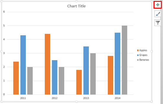
- Select the chart you want to work with. This action will bring up the Chart Elements button towards the top-right of the chart, indicated by the plus sign, as shown highlighted in red within Figure 1, below. Now, click this button.

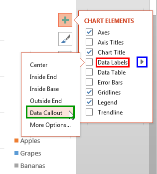
Figure 1: Chart selected - This steps opens the Chart Elements gallery. Within the Chart Elements gallery, hover your cursor over the Data Labels option as shown highlighted in red within Figure 2, below. Doing so brings up a right-arrow as shown highlighted in blue within Figure 2. Click this right-arrow to open the Data Labels sub-gallery. Within this sub-gallery, select the Data Callout option, as shown highlighted in green within Figure 2.

Figure 2: Data Callout option within the Chart Elements gallery - Other options within the Chart Elements gallery are explained explained in our Chart Data Labels in PowerPoint 2013 for Windows tutorial.
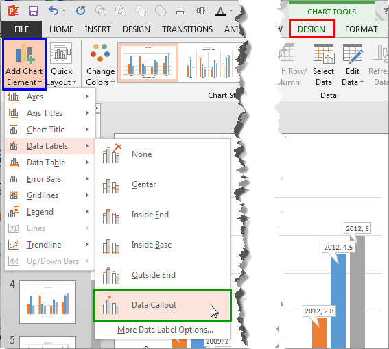
- Alternatively, select the chart on your slide as shown in Figure 1, above. Doing so brings up two Charts Tools contextual tabs of the Ribbon. Select the Design tab, highlighted in red within Figure 3, below. Then, click the Add Chart Element button shown highlighted in blue within Figure 3. This opens a drop-down gallery as shown in Figure 3. Within this drop-down gallery, select the Data Labels option to open a sub-gallery. Within this sub-gallery, select the Data Callout option, highlighted in green within Figure 3.

Figure 3: Data Callout option within the Data Labels sub-gallery of Add Chart Element drop-down gallery Note: The
Chart Tools,
Design and
Format tabs are
contextual tabs. These tabs are special tabs in the
Ribbon that are not visible all the time. They only make an appearance when you are working with a particular slide object which can be edited using special options.
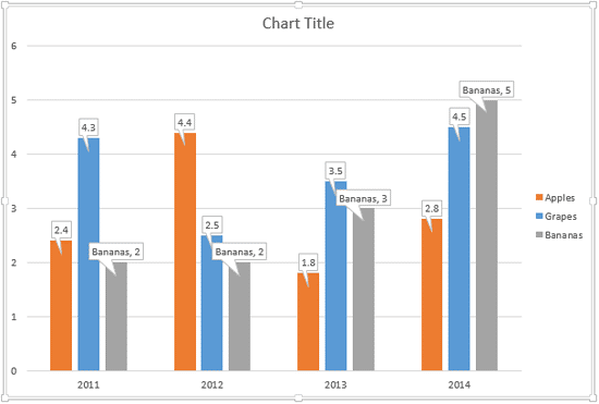
- Either of these options places data labels at the top of each series within a rectangular callout, as shown in Figure 4, below.

Figure 4: Data callouts added to the chart - You can also change this simple rectangle callout to any other shape, as explained in our Change Callout Shapes for Data Labels in PowerPoint 2013 for Windows tutorial.
- Save your presentation.
