![]()
This is the print version of this page. All content is copyright Indezine.com 2000-2023.
![]()
Page 150 of PowerPoint tutorials, presentation essentials, personality interviews, and PowerPoint news.
Previous Archive Page | Next Archive Page
Author: Geetesh Bajaj
Product/Version: PowerPoint
October 23, 2013

Adding Data Labels to your charts in PowerPoint is one of the ways to make it more effective. But sometimes using this option may spoil the look of your chart because the Data Labels you used are too long and overlap each other, below where Series names show as Data Labels. To avoid this kind of issues, and also to format the Data Labels for different purposes such as adding some more elements to them, or change their text color etc, you need to format them as explained in this tutorial.
Explore other options to format Chart Data Labels in PowerPoint 2011 for Mac.
October 22, 2013

In this issue, Kurt Dupont of PresentationPoint discusses the new DataPoint 2 add-in for PowerPoint that lets you interface your slides with databases. PowerPoint 2013 for Windows users can learn about changing charts from one type to another, and working with shape fills. PowerPoint 2011 for Mac users can also explore Data Labels in charts. And finally, do not miss the new discussions and templates of this week!
Read Indezine's PowerPoint and Presenting News.
October 22, 2013

Picture fills may appear convincing or confusing -- well it all depends upon the type of picture you use for the fill. Do remember that using a detailed or crowded picture as a fill for a small shape will get you no awards for slide design! It's best to use pictures that have one focused object or are subtle in nature for this purpose. Any shape on your slide in PowerPoint 2013 can be provided with a picture fill in the same way as you add or change solid fills or gradient fills.
Learn how to add a picture fill to selected shapes in PowerPoint 2013.
October 21, 2013

David Cowan is developer of the FlexiPrez add-in for PowerPoint. Although his educational background is in Civil Engineering, he has also worked in Project and Business Management roles including with the Salvation Army in Zambia and Bible College SA in Adelaide, Australia. It was while working in the education field that he developed an interest in making PowerPoint presentations more interactive, particularly for lecturers. This interest eventually led to the development of FlexiPrez. In this conversation, David discusses FlexiPrez.
October 21, 2013

In PowerPoint, you can use category names, series names, or values as Data Labels within charts -- more often than not, most charts show values as Data Labels -- and values denote numbers! When you use numbers as Data Labels, you may want to format them for several reasons such as limiting or expanding the number of decimal digits shown, or including the currency symbol along with the values, or show the value in percentage etc.
Learn how to format Chart Data Labels (numbers) in PowerPoint 2011 for Mac.
October 18, 2013

Whenever a new shape is inserted on a slide in PowerPoint 2013, it is filled by default with a solid color (or something else depending on the Theme your presentation is based on). Other than a solid fill type, PowerPoint 2013 provides several more options that let you fill a shape with a picture, a gradient, a pattern, or a texture -- and we have explored these other fill options in our Fills for Shapes in PowerPoint 2013 tutorial. In this tutorial, we'll show you how you can work with solid color fills.
Learn how to add solid fill to selected shapes in PowerPoint 2013.
October 17, 2013

In PowerPoint even though you can use Category or Series names as Data Labels, most of the time users tend to use Values as Data Labels. Values are typically numbers, and there are many ways in which you can format these Data Labels. You may want to do so for several reasons such as limiting or expanding the number of decimal digits shown, or to show a currency symbol along with the values, or even to show the value in percentage etc. Do note that these format changes can be made both within Excel and PowerPoint -- in this tutorial, we explore how you do so in Excel at the data level (all data for PowerPoint charts resides in Excel).
Learn how to format numbers used as Chart Data Labels using Excel in PowerPoint 2011 for Mac.
October 16, 2013

Kurt Dupont, based out of Belgium heads PresentationPoint, a company that creates several amazing PowerPoint add-ins. After his Computer Science studies, Kurt started with Andersen Consulting (Accenture nowadays) in Brussels. After 3 years he moved to the Brussels Airport Terminal Company that runs the Brussels airport - this last placement inspired the start-up of Take-off (now known as PresentationPoint) in 1998. In this conversation, Kurt discusses DataPoint 2, the new version of his flagship product that lets you integrate data from external sources within PowerPoint slides.
October 16, 2013

When you insert shapes within a PowerPoint 2013 slide, you will notice that all shapes you insert contain the same fill. Most of the time, the shapes may contain a solid color fill. Similarly, you may insert hundreds of shapes and they all have this same default fill -- have you ever wanted to change this fill to something else? Before we explore changing fills, it is important to understand that the default fill you see for new, inserted shapes is influenced by the Theme applied to your presentation -- all new presentations have a simple Theme applied to them -- this Theme decides the default color or style for the new shape. Thus, all new shapes that you insert will have the same fill.
Learn about different fills types for shapes in PowerPoint 2013.
October 15, 2013
In this issue, we bring you the fantastic Halloween PowerPoint Kit that contains everything you need to create Halloween themed picture slides. Chris Caruso of Brainshark discusses how you can use Embedly with Brainshark content to share it so much more elegantly on Facebook and LinkedIn. Dave Paradi discusses the fascinating results of his 2013 Annoying PowerPoint Survey. PowerPoint 2013 for Windows users can learn about various Chart Elements, including the Legend. PowerPoint 2011 for Mac users can also explore charting stuff such as Quick Layouts, Chart Titles and Data Labels. And finally, do not miss the new discussions and templates of this week!
Read Indezine's PowerPoint and Presenting News.
October 15, 2013

Adding Data Labels to your charts in PowerPoint is one of the ways in which you can make them more effective and relevant for your audience. Using options within the Format Data Labels dialog box, you can further format Data Labels to suit your requirements, as explained in this tutorial.
Learn how to format Chart Data Labels in PowerPoint 2011 for Mac.
October 14, 2013

PowerPoint 2013 provides all the basic chart types such as Column, Bar, Line, Pie, etc. -- and also some advanced charts like Radar, Surface etc. Together, all these chart types work for almost every kind of graphical data representation. To change a chart type from one to another, you first need to insert a chart in PowerPoint 2013. Thereafter, follow these steps to change the chart type.
Learn how you can change your chart type from one to another in PowerPoint 2013.
October 11, 2013

Data Labels in charts are used to display the value, or the name of the Chart Series, or Categories right above or next to the Series on the chart. Adding Data Labels can help the presenter reveal exact values along with the Series, so that he or she need not check on the Y axis to ascertain approximate values of any Series. In this tutorial, let us learn how to add Data Labels in a chart.
Learn how to add Chart Data Labels in PowerPoint 2011 for Mac.
October 10, 2013

Dave Paradi has been recognized by the media and his clients as a presentation expert. He has authored seven books on effective PowerPoint presentations and he consults on high-stakes presentations including one used to brief one of President Obama's cabinet ministers. Dave is one of two Canadians, and one of only twelve people in North America to be recognized by Microsoft with the PowerPoint Most Valuable Professional Award for his contributions to the PowerPoint presentation community. His ideas have appeared in publications around the world. In this conversation, Dave discusses the results of the 2013 Annoying PowerPoint Survey.
October 10, 2013
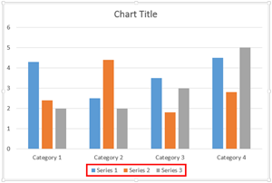
The Legend within a chart is one of those chart elements that lets you identify all the Series in a chart via color or pattern. Typically, the Legend is a box or area with swatches -- the Legend captions individual series with different colors so that you can follow which Series each of the columns in that chart represent.
Learn about Chart Legend in PowerPoint 2013.
October 9, 2013

Chris Caruso is chief technology officer at Brainshark, Inc., a leader in cloud-based business presentations. Brainshark's offerings include Brainshark On-Demand -- for turning static content such as PowerPoint documents into online and mobile video presentations -- and SlideShark, the award-winning app for showing PowerPoints from the iPad and iPhone. Thousands of companies use Brainshark to improve the reach and results of their business communications, while dramatically reducing costs. In this conversation, Chris discusses how Brainshark has teamed up with Embedly to make social media posts more dynamic.
You May Also Like: More Gradients in PowerPoint 2013 for Windows | Viral Video In Two Steps: Presentation And Perseverance


Microsoft and the Office logo are trademarks or registered trademarks of Microsoft Corporation in the United States and/or other countries.
