![]()
This is the print version of this page. All content is copyright Indezine.com 2000-2023.
![]()
Page 172 of PowerPoint tutorials, presentation essentials, personality interviews, and PowerPoint news.
Previous Archive Page | Next Archive Page
Author: Geetesh Bajaj
Product/Version: PowerPoint
June 30, 2014

Gridlines are the lines that span wide and tall within the chart's Plot Area. These Horizontal and Vertical gridlines originate from the axes, which makes the data easier to comprehend for the viewer. Gridlines may emerge from both the horizontal and vertical axes, although by default you can see only Horizontal gridlines on the chart.
Learn about Chart Gridlines in PowerPoint 2013.
June 27, 2014

The Plot Area of a chart, which is transparent by default, can be enhanced with various fill types. But you should exercise some caution -- a busy Plot Area will subdue the actual chart! This can be avoided by taking a little precaution while choosing the fill type and also when you apply it. In this tutorial, we will explore texture fills.
Learn how to apply texture fills to the Plot Area of a chart in PowerPoint 2013.
June 26, 2014

These combine-and-use stars symbols are already colored using popular colors - and since they are native PowerPoint objects, you can change their fills, lines, and effects. These stars are contained within a sample presentation you can download. Just copy the star clip art(s) you like and paste into another PowerPoint slide, or even a Word document or Excel worksheet.
Download and use these star shapes.
June 26, 2014
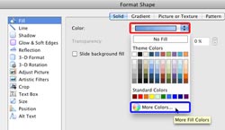
PowerPoint provides an option to fill any shape with a solid fill color easily. But what if you want a specific color to be filled? Maybe you need to use specific colors that are part of your company's corporate identity. In that case, you will need to get an RGB value of that color. So what is RGB? RGB stands for Red, Green, and Blue -- and each of these three colors possess a value within the RGB color model. Let's now imagine that you have a particular RGB value that you want to use as a fill for any shape -- follow the steps below to learn how to add a rectangle of the color.
Learn about how to work with RGB Colors in PowerPoint 2011 for Mac.
June 26, 2014

Picture fills can look great and distracting depending upon the type of picture you choose -- and the object that you fill with the picture can also make a difference. If you need to use a picture as a fill for your chart's Plot Area, then you must put in plenty of thought because you don't want to crowd your chart. Therefore you can use a picture, but it's best to use one that's muted enough and does not attract too much attention.
Learn how to apply picture fills to the Plot Area of a chart in PowerPoint 2013.
June 25, 2014

Want to create an animated box that's drawn in PowerPoint? This wasn't such an easy challenge after all because PowerPoint's Motion Path and Wipe animations do not sync by default, even with the same timings! Once you learn the trick of overcoming this limitation, the results are quite easy to achieve.
Download and use these slides.
June 25, 2014

Gradient fills are typically blended fills between two or more colors that graduate from one color to another -- and if you use neutral or muted colors, then a gradient fill can provide a great, understated backdrop for your chart. In this tutorial, let us learn how to apply a gradient fill to the Plot Area of a chart.
Learn how to apply gradient fills to the Plot Area of a chart in PowerPoint 2013.
June 24, 2014

In this issue, we first look at Analog Storyboards, and how we human beings have an amazing relation with touch and texture. We then have a guest post on a quick way to make color theory work on our slides. PowerPoint 2013 users can learn about line weight for table borders. We also explore fills for Plot Area of charts, and rehearsing slide timings. PowerPoint 2010 users can explore inserting screenshots. PowerPoint 2011 for Mac users can learn about creating curved shapes.
Read Indezine's PowerPoint and Presenting News.
June 24, 2014

Typically, the Plot Area sports no fill attributes, and thus shows the slide's background. You can apply any fill to your chart's Plot Area. The reason why you would like to do that is to highlight the Data Series and Gridlines that populate your chart's Plot Area, especially if you have a busy slide background. In this tutorial, let us learn how to apply a solid fill to the chart's Plot Area in PowerPoint 2013.
Learn how to apply solid fills to the Plot Area of a chart in PowerPoint 2013.
June 23, 2014

These storyboard templates can be used for PowerPoint, Keynote, Google Slides, Prezi, or any other application that requires a story to begin with. Each sequence within the printed storyboard is related to a single slide or stop for your storyboard. Print these and use as required.
June 23, 2014

To use any of the options available within OneDrive (previously known as SkyDrive), including the creation and editing of presentations in PowerPoint Online, you will have to first sign in with your Microsoft account. A Microsoft account (previously called a Windows Live ID) is essentially your account on any of Microsoft's services such as Hotmail, Outlook, XBox, Live, Zune, etc. In this tutorial, we explain how you can sign in.
Learn how to sign in to your OneDrive account.
June 23, 2014

Let us assume that someone has provided you with an RGB value for a color, and has asked you to add a rectangle of that color to a slide. Then how do you proceed? Before proceeding, make sure you know what RGB colors are, and specifically what the three values: R, G, and B indicate. Once you have these R, G, and B values, you can easily access that color within PowerPoint.
Learn about how to work with RGB Colors in PowerPoint 2010.
June 20, 2014

Once you create your presentation slides, and you are happy with the results, it's time to practice your delivery, your timing, and your pace. More importantly, it is time to be comfortable with your slides. Nothing can help you better than PowerPoint's powerful Rehearse Timings feature that we will explore within this tutorial.
Explore the Rehearse Timings feature in PowerPoint 2013.
June 19, 2014

These days we are cocooned in a virtual world, a world where our minds are encircled by new touch devices of all sorts. So does touch translate to some texture? Some grain? No - not at all. In today's world, touch means glass, metal, or plastic - and all of them have flat, non-textured, and non-grainy surfaces. Other senses such as sound are absent too. There's no scribble of the pencil or the sound of paper being torn or turned.
Learn why we humans are more in tune with analog storyboards rather than electronic ones.
June 19, 2014

In a chart, the Plot Area is the backdrop upon which other chart elements such as Data Series and Gridlines are placed. This layer has axes on its perimeter. By default, the Plot Area has no fill attributes, and is transparent. This may look plain, and that by itself is no reason to change the fill of the Plot Area. However, there are times when the slide background itself is busy -- and adding a different fill to the Plot Area can then make the chart appear more clear.
Learn how to apply fills to the Plot Area of a chart in PowerPoint 2013.
June 18, 2014

You don't need a graphic design education. You don't need to "be designy" or "be artsy", you don't need to read 15 books on color theory. You can do it yourself, in minutes. But first we need to talk about why well designed presentations are important.
Read more in this post by Devesh Khanal.
You May Also Like: Colors: Blue | PowerPoint and Presenting News: July 1, 2014


 in PowerPoint 2013 for Windows")
Microsoft and the Office logo are trademarks or registered trademarks of Microsoft Corporation in the United States and/or other countries.
