![]()
This is the print version of this page. All content is copyright Indezine.com 2000-2023.
![]()
Page 188 of PowerPoint tutorials, presentation essentials, personality interviews, and PowerPoint news.
Previous Archive Page | Next Archive Page
Author: Geetesh Bajaj
Product/Version: PowerPoint
December 4, 2014

SlideShare has been a repository of slides you create in other programs such as Microsoft PowerPoint or Apple Keynote - and then upload to their site. Now, something completely different has been announced - the option to create slides within SlideShare itself! We already explored how Haiku Deck plugs right within SlideShare and allows you to create slides. In this post, we will explore the Haiku Deck interface.
December 4, 2014

It's good to avoid using 3D charts unless your chart data requires a Z-axis. Having said that, we have chosen the topic of making your 3D columns in a chart transparent. Yes, there's a reason to do so especially when you find that some of the columns in your 3D chart may be hiding behind one or more of the other columns, just because they are not tall enough. One easy solution for this problem is to reduce the opacity of the columns in the front.
Learn how to make 3D columns transparent for charts in PowerPoint 2013.
December 3, 2014

In a PowerPoint column chart, Axes are typically positioned on the left and bottom of the Plot Area. However, there may be scenarios where your chart axes cross each other within the Plot Area rather than be located on its edges. Attaining such a crossed axes can be desirable due to a variety of reasons in both the Value and Category axes.
Learn how to add and alter the position of crossed axes in PowerPoint 2013.
December 3, 2014

For many slides, you may want to create custom graphics that include a human head. Here are some female head silhouette graphics for PowerPoint - these are perfect for the presentation slides that relate to thought processes, visualization, sociology, psychology, communications, and more. We provide you with 4 typical graphics in a silhouette style. To these head graphics, just add any other icon style graphics to end up with something that explains a concept -- examples include gears, atoms, bulbs, jigsaws, mazes, etc.
Download and use these graphics in your slides.
December 2, 2014

This week we bring you exclusive conversations with Arpit Dhariwal of SlideShare and Motti Nisani of emaze. We also explore how you can use Haiku Deck within SlideShare to create your own presentations. PowerPoint 2013 users can learn more from a bunch of tutorials on Chart Axes.
And don't miss the new discussions and templates of this week!
Read Indezine's PowerPoint and Presenting News.
December 2, 2014

Sometimes your data type may require a second axis. The sample data that we took for this tutorial pertains to the average temperature and rainfall in London across the 12 calendar months of a year. The temperature is depicted in Celsius and the rainfall is in millimeters. What you should note carefully is that the value range of temperature spans between 30 and 70, whereas the range for rainfall is in between 0 to 12 (approximately). A chart that results from this data doesn't live up to the comparison since we are trying to compare items that are from different data ranges.
Learn how to add a Secondary Value axis to charts in PowerPoint 2013.
December 1, 2014

For many slides, you may want to create custom graphics that include a human head. Here are some male head silhouette graphics for PowerPoint - these are perfect for the presentation slides that relate to sociology, psychology, communications, and more. We provide you with 4 typical graphics in a silhouette style. To these head graphics, just add any other icon style graphics to end up with something that explains a concept - examples include gears, atoms, bulbs, jigsaws, mazes, etc.
Download and use these graphics in your slides.
December 1, 2014
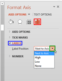
Do you like the default positions where PowerPoint places your axis labels? Yes, we do believe that the defaults do work best because audiences expect these labels to exist at these familiar locations. However, there may be times when you probably don't even need labels for your axes - or you may want them placed in another location so that your charts look cleaner. Whatever your purpose may be, it is indeed possible to change the position of axis labels vis-à-vis the axis.
Learn how to hide the axis labels and also how to reposition them in PowerPoint 2013.
November 28, 2014

Until now, SlideShare has been a repository of slides you create in other programs such as Microsoft PowerPoint or Apple Keynote – and then upload to their site. And then now something completely different has been announced – the option to create slides within SlideShare itself! In this tutorial, we will explore how you can create a basic presentation within SlideShare.
Explore how you can create a basic presentation within SlideShare.
November 28, 2014

Axis Labels are the labels for the Categories and Values on chart axes. So, where do these labels come from? Category axis labels reflect the Category names within your data (typically within the built-in Excel sheet). Values on the other hand are determined by PowerPoint based upon the maximum value in your data -- the minimum value is always set to zero. Of course you can change the Minimum and Maximum values if you want.
Learn how to change the axis labels in PowerPoint 2013.
November 27, 2014

Arpit Dhariwal is a Senior Product Manager at SlideShare, leading the content acquisition team. The team is committed to offering multiple ways to share ideas and expertise of users with fellow professionals through SlideShare. Prior to joining LinkedIn in 2012, Arpit worked with multiple internet and technology companies. Arpit has a B.Tech from Dhirubhai Ambani Institute of Information & Communication Technology and an MBA from S.P. Jain Institute of Management & Research. In this conversation, Arpit discusses SlideShare's slide creation options.
November 27, 2014

While learning about chart axes, you will come across two terms, Major and Minor units. These are the intervals at which the axis spaces itself -- as the name itself suggests, you can choose to space the axis at two levels: Major and Minor. PowerPoint sets the Major and Minor units on its own -- many times, this may be exactly what you need. At other times, you may want to set specific intervals for the Major and Minor units for several reasons.
Learn how to change the Major and Minor units of Value axis in PowerPoint 2013.
November 26, 2014

If your chart data values are not so much different from each other, the chart created using this data will not help your audience to differentiate the series representing those values. Our sample data explores how people of different age brackets choose their favorite colors. If you look closely at the data, you will realize that all values span between 285 and 365. So, it makes no sense to even discuss any value lower than 250 or above 370 for this data set.
Learn how to set the Minimum and Maximum values on Value Axis of Charts in PowerPoint 2013.
November 25, 2014

This week we bring you an exclusive tutorial from Taylor Croonquist on creating a waterfall chart in PowerPoint. PowerPoint 2013 users can learn more from a bunch of Photo Album tutorials. Users of PowerPoint 2011 for Mac will learn about playing sounds across successive slides. And don't miss the new discussions and templates of this week!
Read Indezine's PowerPoint and Presenting News.
November 25, 2014

The text used to label the chart axes in a chart is called an Axis Title. All chart types other than Pie and Doughnut have axes -- and although Radar charts have an axis, there is no provision to add Axis Title for them. In all other chart types such as Column, Line, etc., Axis Titles are not visible by default.
Learn how to add and edit Axis Titles in PowerPoint 2013.
November 24, 2014

Motti Nisani is the CEO of emaze, a company that produces a tool of the same name. With emaze, you can create presentations in virtual 3D worlds or simply in slides like. He has a B.Sc. degree in Engineering from Tel-Aviv University, Israel. In this interview, Motti discusses what's new about emaze.
You May Also Like: Axis Titles in PowerPoint 2013 for Windows | Reposition and Hide Axis Labels in PowerPoint 2013 for Windows


Microsoft and the Office logo are trademarks or registered trademarks of Microsoft Corporation in the United States and/or other countries.
