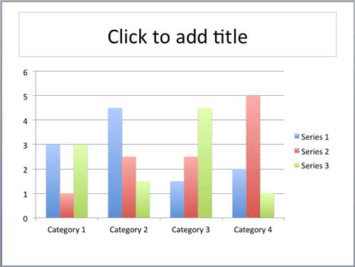
If the data required for your chart is already within Excel, then you can create your chart in Excel itself, and then copy-paste it into a PowerPoint slide. Alternatively you can directly insert a new chart within PowerPoint.
To learn more, follow these steps in PowerPoint 2011 for Mac:
- Open your presentation and insert a new slide where you want to place your Chart. Alternatively, launch PowerPoint 2011 for Mac to see the Presentation Gallery. Click Cancel in this gallery to open a blank presentation with a new slide.
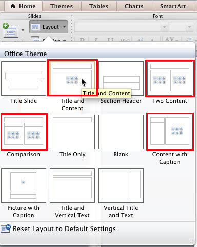
- Click the Layout button in the Home tab of the Ribbon to bring up the Layout gallery as shown in Figure 1. Select any of the layouts that include a Content placeholder. These are highlighted in red within Figure 1. We explain what a content placeholder is in the next paragraph.

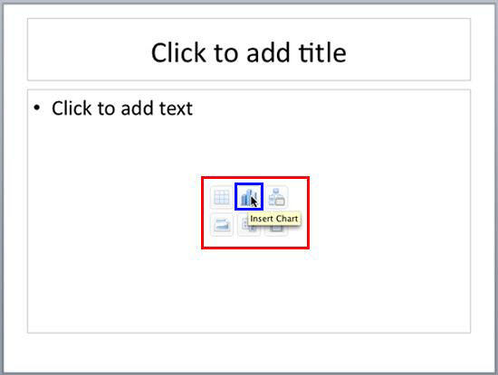
Figure 1: Slide layout with a content placeholder selected - A content placeholder allows you to add bulleted text or any of the six other content types, indicated by the six buttons as shown highlighted in red within Figure 2.

Figure 2: Content Placeholder - There are three ways of inserting a chart on your slide:
- Click the Insert Chart button (highlighted in blue within Figure 2) among the six buttons in the content placeholder.
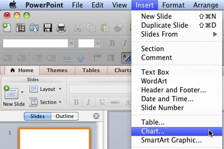
- If you want to insert a chart in a slide that has no content placeholder, just select the Insert | Chart menu option as shown in Figure 3.

Figure 3: Insert Chart menu option - Click the Charts tab of the Ribbon that you can see highlighted in red within Figure 4.

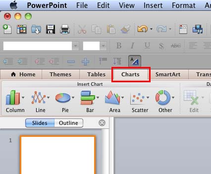
Figure 4: Insert Chart group within Charts tab of the Ribbon
- All of the three ways explained above will make the options within the Charts tab of the Ribbon active as shown in Figure 4. Since you don't have any chart on your slide yet, all other options in this tab will be grayed out except the options within the Insert Chart group.
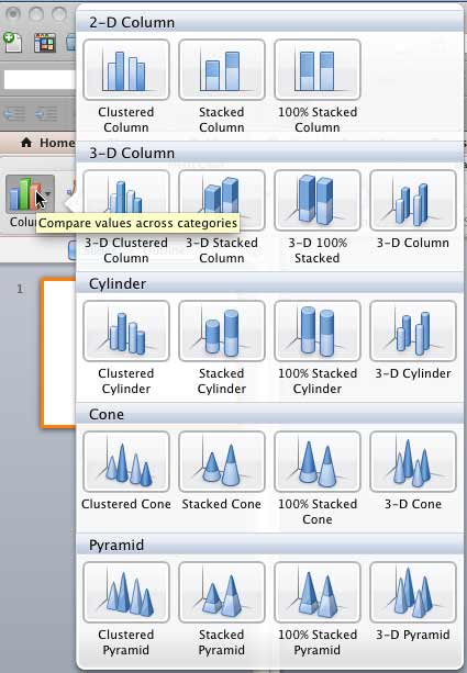
- As you can see in Figure 4 above, the Insert Chart group includes several buttons that represent various chart types. Clicking any of these buttons will open a gallery displaying a collection of chart variants of that particular chart type. In Figure 5 you can see the gallery for Column chart type, and you can also see a tool tip describing Column charts. You will see such tool tip for all other types of charts, which can be helpful in deciding the type of chart for your slide.

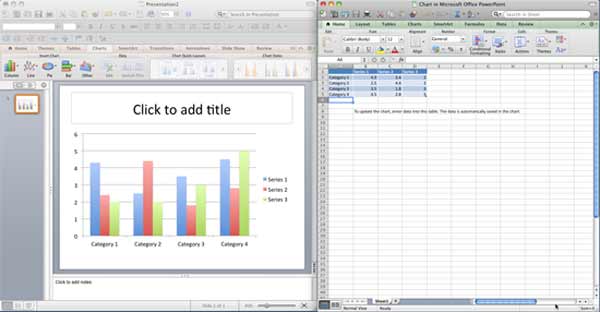
Figure 5: Column Chart gallery - Click on any of the Chart variant thumbnails. This will place a chart on the slide that is based on dummy data. At the same time, this launches Microsoft Excel in a new window showing the dummy data upon which the inserted chart is based. In Figure 6 you can see the chart and the Excel sheet placed side by side.

Figure 6: Chart and Excel sheet with default values Note: When you insert a chart, you may not see both PowerPoint and Excel windows placed side by side. Instead, you may see only Excel sheet hiding the PowerPoint window entirely. But you can always rearrange the windows as for your convenience.
- Now, replace the dummy data in the Excel sheet with your own data following these guidelines:
- Select a cell in the Excel sheet, and enter the new value.
- You can move to the cell towards the right in the Excel sheet by pressing the Tab key. Move to the cell below by pressing the Enter(Return) key.
- To insert a new column in the Excel sheet, right-click the header of the next column and choose the Insert option.
- To insert a new row in the Excel sheet, right-click the header of the next row and choose the Insert option. Remember, column or row content inserted this way ends up as a new series value in your chart.
- You can also delete columns and rows. Just select the row or column header, right-click, and choose the Delete option.
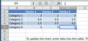
- Figure 6 above shows dummy chart data. The changed data can be seen in Figure 7.

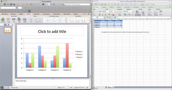
Figure 7: Changed data in the Excel data sheet - Any change you make in the Excel sheet (refer to Figure 7) will reflect as a change in the chart within PowerPoint slide, as shown in Figure 8.

Figure 8: Updated chart in PowerPoint 2011 - Once you have replaced the dummy data with the actual data, close Microsoft Excel. In Figure 9 you can see the new chart inserted with the data you entered in the Excel sheet.

Figure 9: Inserted Chart - To make more changes to the data, select the chart and within the Data group click the Edit button (highlighted in red in Figure 10). This opens the Excel sheet again, where further changes to the data can be made. To learn more how to edit chart data, refer to our Edit Chart Data in PowerPoint 2011 for Mac tutorial.

Figure 10: Edit button within Data group Tip: You can also select and right-click (or Ctrl+click) the chart, and then choose the Edit Data option to open the Excel sheet.
