Indezine Logo


Inserting Charts in PowerPoint 2013 for Windows

Learn how you can insert a chart in PowerPoint 2013 for Windows. While inserting, you can choose the chart type you want to insert.


Author:

Product/Version: PowerPoint 2013 for Windows

OS: Microsoft Windows 7 and higher


Learn PowerPoint

Presentation Management 27: The Humanity of Presentations, from Cave Paintings to PowerPoint and Back Again


When you need to describe the relation between two or more sets of values in your presentation, charts are probably your best option. First of all, you should decide upon the chart type you require based on the data you are going to present. Then, follow these steps to insert a chart on your slide in PowerPoint 2013 for Windows:
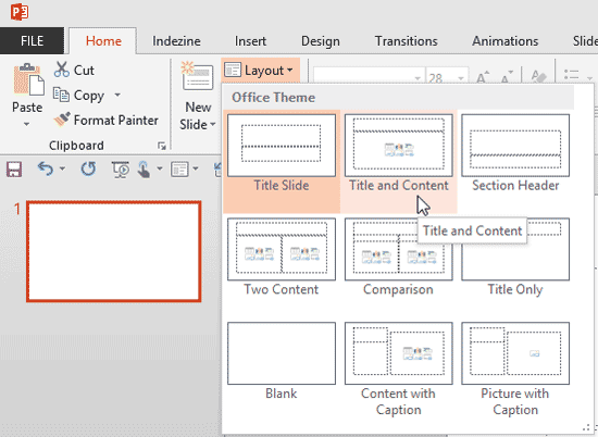
  1. Create a new presentation in PowerPoint, or open your presentation and navigate to the slide where you want to insert a chart. If you created a new presentation in PowerPoint, the first slide may be based on the default Title Slide layout. Change the Slide Layout. Make sure to select any layout that includes a Content placeholder (the small palette like collection of multicolored buttons visible on some of the slide layouts) as shown in Figure 1.
  2. Layout gallery
    Figure 1: Layout gallery
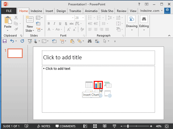
  3. If your slide layout has a Content placeholder (see Figure 2), click the Chart button (highlighted in red within Figure 2) among the six buttons in the center of the slide.
  4. Chart button within the Content Placeholder
    Figure 2: Chart button within the Content Placeholder
  5. Alternatively, if you want to insert a chart in a slide that has no content placeholder, just select the Insert tab of the Ribbon (highlighted in red within Figure 3), and click the Chart button (highlighted in blue within Figure 3).
  6. Chart button within the Insert tab of the Ribbon
    Figure 3: Chart button within the Insert tab of the Ribbon
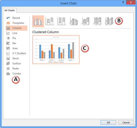
  7. Either of these options opens the Insert Chart dialog box that you can see in Figure 4.
  8. Insert Chart dialog box
    Figure 4: Insert Chart dialog box
  9. Let us explore the options within the Insert Chart dialog box, as marked in Figure 4 above:
  10. A. Chart Types

  11. This section provides you with a list of all chart types. Here, select the chart type that suits the nature of data you are going to present.
  12. B. Chart Variants

  13. In this section you can see the variants of the chart type you have selected. Just click on any variant that you want to use.
  14. C. Chart Preview

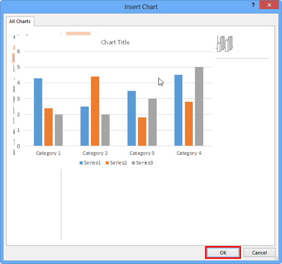
  15. This section shows the name and a preview of the chart variant you have selected (see Figure 4, above). If you want to take a look at the enlarged variation of that preview, just hover your cursor on it. The preview instantly changes into a large image as shown in Figure 5.
  16. Chart preview changed to a large image
    Figure 5: Chart preview changed to a large image
  17. Select a chart based on your requirement, and click the OK button (highlighted in red within Figure 5).
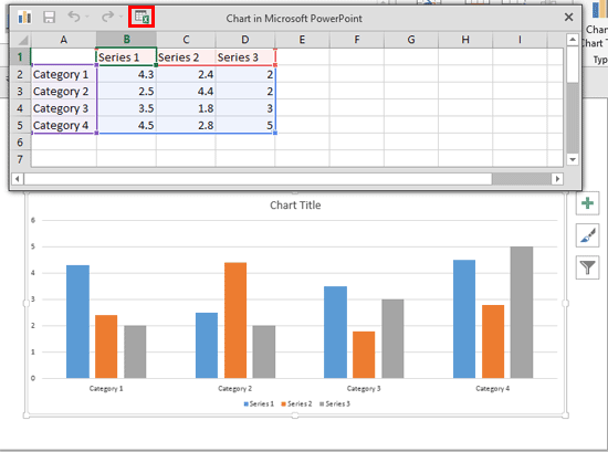
  18. This will place a chart on the slide, as shown in Figure 6. At the same time, an instance of the Excel sheet containing dummy data is also opened, as shown in Figure 6. If you want to see the larger Excel window, click the Excel icon (highlighted in red within Figure 6) within this sheet.
  19. Chart inserted on the slide
    Figure 6: Chart inserted on the slide
  20. Note that the dummy data within Excel is only some filler content. You should replace this with your own data. Follow these guidelines to replace the data:
    1. To change any value, select the cell in the table, and enter the new value.
    2. You can move to the cell towards the right in the Excel sheet by pressing the Tab key on your keyboard. Or move to the cell below by pressing the Enter(Return) key.
    3. To insert a new column, right-click the header of the next column and choose the Insert option. Remember, any column content inserted this way ends up as a new Series in your chart.
    4. To insert a new row, right-click the header of the next row and choose the Insert option. Remember, any row content inserted this way ends up as a new Category in your chart.
    5. You can also delete the columns (Series) and rows (Categories). Just select the row or column header, right-click, and choose the Delete option.
    6. If you already have existing Excel data that you want to use, then copy this data from your Excel sheet and paste it within the same area as the dummy data. You will want to add or remove columns and rows as explained in the preceding guidelines so that the data you copy and paste has the same number of rows and columns as populated in the chart’s Excel sheet (the dummy data).
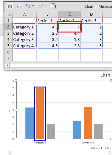
  21. Make changes as required. Any changes you make in the Excel table (highlighted in red within Figure 7) will reflect as changes on the chart within PowerPoint (highlighted in blue within Figure 7), as shown in Figure 7.
  22. Changes being made in the Chart data reflect in the chart
    Figure 7: Changes being made in the Chart data reflect in the chart
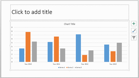
  23. Close the Excel window (or the entire application once you are done with replacing the dummy data with the actual data). Now your chart is ready as shown in Figure 8.
  24. Chart with changed values
    Figure 8: Chart with changed values
  25. Save your presentation often.

See Also:

Chart Basics: Inserting Charts (Glossary Page)

Inserting Charts in PowerPoint 2016 for Windows
Inserting Charts in PowerPoint 2011 for Mac
Inserting Charts in PowerPoint 2010 for Windows
Inserting Charts in PowerPoint 2007 for Windows
Inserting Charts in PowerPoint 2003 for Windows

You May Also Like: Using the Chains Feature in ToolsToo v10: Conversation with Gil Segal | Latin America PowerPoint Templates


Popular Posts

Pivot Tables in PowerPoint: by Kasper Langmann
One of the most commonly used features in Microsoft Excel is the Pivot Table. A Pivot Table simply allows you to make better sense of data by giving you different options of how to view that data.

Get More SmartArt Graphics
Learn how you can get more SmartArt graphic variants.

Character Spacing in PowerPoint 2013
Explore Character Spacing options in PowerPoint 2013.

Add Secondary Value Axis to Charts in PowerPoint 2013 for Windows
Learn how to add a Secondary Value axis to charts in PowerPoint 2013 for Windows.


Jigsaw Graphics for PowerPoint

Here are 10 jigsaw graphics containing different shapes. These graphics are available in both black and white and are contained within separate sample presentations that you download. Additionally, these jigsaw graphics are vector shapes, so you can easily edit them within your Microsoft Office program by changing fills, lines, and effects or even applying Shape Styles.

Download and use these Jigsaw Graphics in your slides for just $4.99+


Microsoft and the Office logo are trademarks or registered trademarks of Microsoft Corporation in the United States and/or other countries.

Home | PowerPoint | Photoshop | PowerPoint Templates | PowerPoint Tutorials | Blog | Notes | Ezine | Media Kit | Feedback | Site Map | About Us | Contact Us

Link to Us | Privacy | Testimonials

PowerPoint Backgrounds | Christian PowerPoint Backgrounds | Business PowerPoint Presentation Templates

Plagiarism will be detected by Copyscape

©2000-2023, . All rights reserved.