Learn about advanced color corrections from Deke McClelland. This section is an excerpt from his book, Photoshop Elements 4 One-on-One.
Author: Deke McClelland
Product/Version: PowerPoint
 Deke McClelland, the author of the book is a well-known Photoshop expert who has authored several best-selling books.
The excerpts chosen to be published on Indezine aim to show advanced color correction possibilities in Photoshop Elements 4.
We wish to thank Dawn Mann, Regina Wilkinson, and Theresa Pulido for facilitating the permission to extract.
ISBN: 0-596-10098-1
The Visible-Color Spectrum Wheel
How to Read and Respond to a Histogram
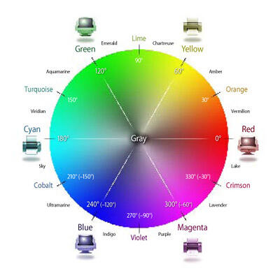
To feel comfortable working in the Color Variations dialog box, it helps to understand the composition of a little thing called the visible-color spectrum wheel. Pictured below, the wheel contains a continuous sequence of hues in the visible spectrum, the saturation of which ranges from vivid along the perimeter to drab gray at the center.

The colors along the outside of the circle match those that appear in a rainbow. But as the labels in the circle imply, the colors don't really fit the childhood mnemonic Roy G. Biv, short for red, orange, yellow, green, blue, indigo, and violet. An absolutely equal division of colors in the rainbow tosses out orange, indigo, and violet and recruits cyan and magenta, producing Ry G. Cbm (with the last name, I suppose, pronounced seebim). Printed in large colorful type, these six even divisions correspond to the three primary colors of light—red, green, and blue—alternating with the three primary pigments of print—cyan, magenta, and yellow.
In theory, cyan ink absorbs red light and reflects the remaining primaries, which is why cyan appears a bluish-green. Cyan and red represent complementary colors, meaning that they form neutral gray when mixed together. The Color Variations dialog box treats complementary colors as opposites. For example, clicking the Decrease Red thumbnail not only reduces the amount of red in the image but also adds cyan. Similarly, Decrease Green adds magenta and Decrease
Blue adds yellow.
Of course, Ry G. Cbm is just a small part of the story. The color spectrum is continuous, with countless nameable (and unnameable) colors in between. I've taken the liberty of naming secondary and tertiary colors in the wheel. Because there are no industry standards for these colors, I took my names from other sources, including art supply houses and consumer paint vendors. I offer them merely for reference, so you have a name to go with the color.
The practical benefit is that you can use this wheel to better predict a required adjustment in the Color Variations dialog box. For example, the color orange is located midway between red and yellow. Therefore, if you recognize that an image has an orange cast, you can remove it by clicking red's opposite, Decrease Red, and then clicking yellow's opposite, Increase Blue.
The other color-wheel-savvy command, Adjust Hue/Saturation (see the "Tint and Color" exercise on page 94), tracks colors numerically. A circle measures 360 degrees, so the Hue value places each of the six primary colors 60 degrees from its neighbor. Secondary colors appear at every other multiple of 30 degrees, with tertiary colors at odd multiples of 15 degrees. To track the difference a Hue adjustment will make, just follow along the wheel. Positive adjustments run counterclockwise; negative adjustments run clockwise. So if you enter a Hue value of 60 degrees, yellow becomes green, ultramarine becomes purple, indigo becomes lavender, and so on. It may take a little time to make complete sense of the wheel, but once it sinks in, you'll want to rip it out of the book and paste it to your wall. Trust me, it's that useful.
In the world of statistics, a histogram is a kind of bar graph in which the bars vary in both height and width to show the distribution of data. In the Levels dialog box, it’s a bit simpler. The central histogram contains exactly 256 vertical bars, each only one pixel wide. Each bar represents one brightness value, from black (on the far left) to white (on the far right). The height of each bar indicates how many pixels correspond to that particular brightness value. The result is an alternative view of your image, one that focuses exclusively on the distribution of colors.
Consider the annotated histogram below. I’ve taken the liberty of dividing it into four quadrants. If you think of the histogram as a series of steep sand dunes, a scant 5 percent of that sand spills over into the far left quadrant; thus, only 5 percent of the pixels in the image are dark. Meanwhile, fully 25 percent of the sand resides in the big peak in the right quadrant, so 25 percent of the pixels are light. The image represented by this histogram contains more highlights than shadows.
One glance at the image itself (opposite page, top) confirms that the histogram is accurate. The photo so obviously contains more highlights than shadows that the histogram may seem downright redundant. But the truth is, it provides another and very helpful glimpse into the image. Namely, we see where the darkest colors start, where the lightest colors drop off, and how the rest of the image is weighted.
With that in mind, here are a few ways to work with the histogram in the Levels dialog box:

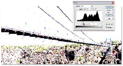
To preview exactly which pixels will go to black or white, press the Alt key as you drag a slider triangle. When dragging the black triangle, any pixels that appear black or any color except white (as in the example at the bottom of this page) are clipped. When dragging the white triangle, Photoshop Elements clips the nonblack pixels.


Bear in mind that these are suggestions, not rules. For example, clipped colors can result in interesting effects. Meanwhile, an overly dark image may look great set behind white type. These suggestions are meant to guide your experimentation so you can work more quickly and effectively inside the Levels dialog box.
You May Also Like: Add Humor to Your Presentation | Full Circles PowerPoint Templates


Microsoft and the Office logo are trademarks or registered trademarks of Microsoft Corporation in the United States and/or other countries.