Planning your PowerPoint chart is a great way to create better charts. This entire series is also available in the form of an ebook.
Author: Geetesh Bajaj
Product/Version: PowerPoint
OS: Microsoft Windows and Mac OS X
While there’s always going to be some people who can end up with wonderful charting results without any planning, it does not work that way for everyone. To understand this better, let’s explore an analogy. Have you seen those folks, who have the gift of the ladle? They need no clues about what they are cooking, yet they just seem to know what to do next. And they end up creating a culinary masterpiece. But most others cannot do so, and may end up with a culinary disaster without planning. It works the same way with charts, chart gurus can make awesome charts just like that! For everyone else, the more you plan, the better your charts will look, and be more capable of explaining your numerical message to the audience.

Figure 1: Cook up better charts
First take a look at your data. Try and visualize your audience then, and think about how you can show this data to them in a way that they can comprehend. You will have to think about the audience’s designations, their age profiles, and their way of thinking, and maybe you will also have to think about where in the world do they come from? Then based on this information, arrive at the Least Common Multiple.
A Least Common Multiple, or LCM is the common ground for all your audiences. LCM is essentially an arithmetical concept that can also be used to understand your audience’s capability to comprehend your charts. You need to make your charts simple enough so that every single member of the audience can understand what you are trying to say. For example, some people in your audience may follow complex charts such as combination, pareto, or waterfall charts. If you don’t know what these terms mean, then you already are in the same category as some of your audience members, and that’s not bad at all. If you know what these terms mean, there may still be others in your audience who do not, and they may be most comfortable with basic column charts. Thus the LCM of your audience is a column chart—stay with that option!
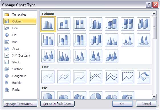
Next you must ponder over what type of chart you need. Don't just create a new chart in PowerPoint and then replace the dummy data. Yes, PowerPoint is good at hand-holding and we won't debate whether that's a good approach or not. At times this hand-holding can help you create a quick chart and newer versions of PowerPoint do default to creating better looking charts than the previous versions. Yet, there is much you can gain by a little planning. PowerPoint does provide a large range of chart types, and it even makes it so easy to change between chart types. But again, it's best that you have a clear idea of what chart type you need even before you start.

Figure 2: PowerPoint may let you change charts but it’s best to make a decision before you begin
10 14 03 - Ten Tips for Cool PowerPoint Charts: PowerPoint Chart Tips 02: Plan Your Chart Type (Glossary Page)
You May Also Like: How Beatboxing Can Help Us Master Successful Business Communication: by Ally Yates | Animals - S PowerPoint Templates


Microsoft and the Office logo are trademarks or registered trademarks of Microsoft Corporation in the United States and/or other countries.