Set minimum and maximum values on value axis of charts in PowerPoint 2011 for Mac. Be careful though and possibly add a warning that the data may appear distorted.
Author: Geetesh Bajaj
Product/Version: PowerPoint 2011 for Mac
OS: Mac OS X
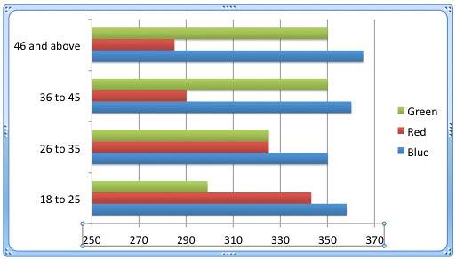
Let's imagine that you need to create a chart from data where values are not too different. Our sample data, shown in Figure 1, below, explores how people of different age brackets choose their favorite colors. If you look closely at the data, you will realize that all values span from between 285 and 365. So, does it makes sense to even discuss any value lower than 250 or above 370 for this data set. The answer to that question is not very easy to answer. Although we do show you how to show a more pronounced change in this tutorial, make sure you read The Ethics of Distortion box towards the end of this page.
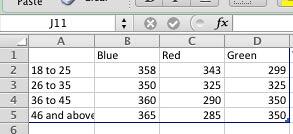
Figure 1: What's your favorite color?
To quickly see the data for any chart, right-click (or Ctrl+click) the chart, and choose the Edit Data option.
Yet, when you create sample column and bar charts from this data using PowerPoint's defaults, you'll end up with charts akin to what you see in Figure 2, below. The chart on the top shows columns that are very similar in their heights. There really is no contrast highlighting the findings of our data. It's the same story with the chart below where the bars look almost similar.
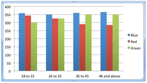
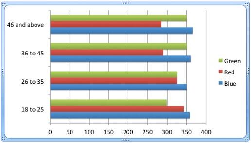
Figure 2: Value Axis in a Column chart and a Bar chart
The reason for lower contrast between values in these charts is that the minimum and maximum values set for the value axis are calculated from a minimum of zero. This actually makes the differences in the column height or bar widths so much less pronounced, and thus makes the chart much less effective as a visual medium.
The value axis is the vertical axis on the left of a typical column chart, or the horizontal axis at the bottom for a bar chart (see Figure 2, above). Learn more about the various types of Chart Axes here.
Fortunately, you can easily choose your own maximum and minimum values. In the following steps, we are using our column chart as an example. But, the same techniques will work for bar charts too.
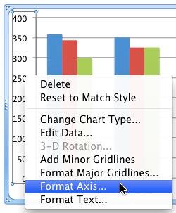
Follow these steps to learn more in PowerPoint 2011 for Mac:
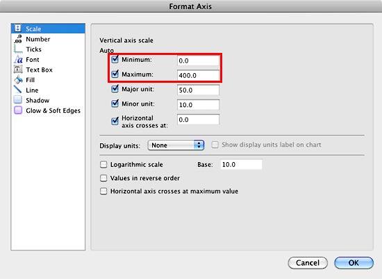
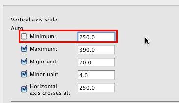
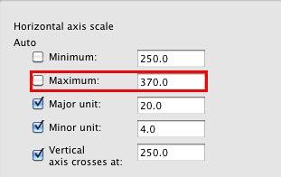
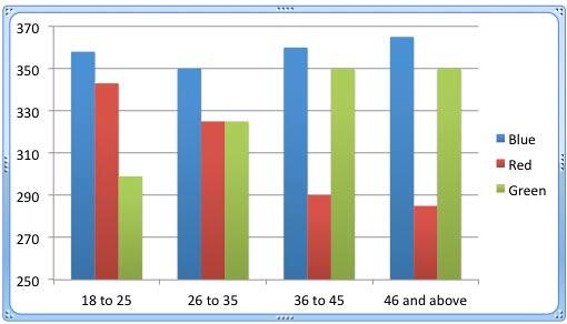
Yes, we did show you how you can change the Minimum and Maximum values on the Value Axis. This makes the difference between the various columns more pronounced. But chart purists differ, and in many ways they are right because although your comparisons are pronounced, they are also not the truth—at least not the whole truth. Many people in your audience may not see that your values do not begin from zero, and some charts created this way may forego the values within the axis altogether. So what should you do? The answer is to strike a balance. If you do alter the values to no longer start at zero, make that very apparent to your audience.
Make sure you add a note to that effect on your slide, and even draw the attention of your audience to this fact.
10 08 03 - Chart Axes: Set Minimum and Maximum Values on Value Axis (Glossary Page)
Set Minimum and Maximum Values on Value Axis in PowerPoint 2013 for Windows
Set Minimum and Maximum Values on Value Axis in PowerPoint 2010 for Windows
You May Also Like: Using Humor to Support a Serious Presentation | Wind Energy PowerPoint Templates


Microsoft and the Office logo are trademarks or registered trademarks of Microsoft Corporation in the United States and/or other countries.