Indezine Logo


Vary Colors by Point Option for Charts in PowerPoint 2013 for Windows

Learn to vary the fill color of a series in a chart in PowerPoint 2013 for Windows. This is very important when you have just one series with multiple categories in your chart.


Author:

Product/Version: PowerPoint 2013 for Windows

OS: Microsoft Windows 7 and higher


Learn PowerPoint

Paste Special In PowerPoint


When a column chart in PowerPoint contains only one data series and several categories, then, by default the individual chart columns may use the same fill color. If your chart uses the same colored series in all categories, it can make your chart look dull as with the chart shown in Figure 2, later on this page. This similar colorization also does not provide a proper way for your audience to compare elements within the individual series.

PowerPoint lets you resolve this problem using two ways like how older versions did. The first way is to select each column individually and change its fill color, which is time consuming. The second option is using the Vary colors by point option. This option fills individual columns with different colors in a single step. Another benefit of using this option is that since these changed colors are Theme based, if you apply a new Theme to the presentation, these colors change automatically to match the new Theme colors. Also, if you add an extra element within the same category, the new column automatically chooses a new color from the Theme without you having to do anything.

Before you proceed further, there are certain characteristics of the Vary colors by point option that you should be aware of:

  • Not enabled by default for Column, Bar, and Line charts, but can be turned on
  • Enabled by default for Pie and Donut charts, but can be turned off
  • Does not work for other chart types such as Area, XY Scatter, Stock, etc.

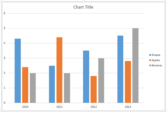
When you insert a new chart it may look like the one you see in Figure 1, below. As you can see, this is a column chart in which there is a set of 3 series in each of the 4 categories. The color of these 3 series (Grapes, Apples, and Bananas) represent the 1st, 2nd, and 3rd accent colors in the active Theme respectively, from left to right. You cannot really vary colors of all columns representing "Grapes" series in this case since that will end up confusing your audience!
A Column Chart in PowerPoint
Figure 1: A Column Chart in PowerPoint

However, the Vary colors by point option works for a column chart with a single series and two or more categories, as shown in Figure 2, below.
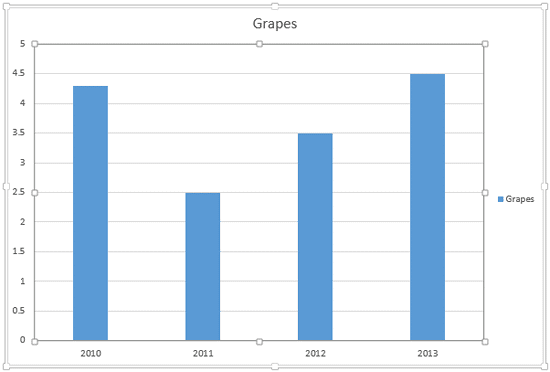
Chart with one Series and four Categories
Figure 2: Chart with one series and four categories

Follow these steps to learn how to change the color of category elements in a chart with just a single series and multiple categories in PowerPoint 2013 for Windows:
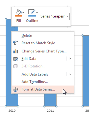
  1. Select the data series by clicking once on any of the columns, or within the chart elements drop-down list. Right-click to bring up the contextual menu, as shown in Figure 3, below. Within this contextual menu, select the Format Data Series option, as shown in Figure 3.
  2. Format Data Series option
    Figure 3: Format Data Series option
  3. Contextual Tabs

  4. The Format Data Series tab is contextual tab. Contextual tabs are special tabs in the Ribbon that are not visible all the time. They only make an appearance when you are working with a particular slide object which can be edited using special options.
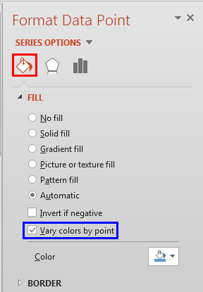
  5. This action will bring up the Format Data Series Task Pane, as shown in Figure 4, below. Within this Task Pane, make sure that Fill & Line button is selected, as shown highlighted in red within Figure 4, below. Next, select the vary colors by point check-box, as shown highlighted in blue within Figure 3, above. Remember that this option will be available only when there is a single series in your chart.
  6. Vary colors by point check-box selected
    Figure 4: Vary colors by point check-box selected
  7. Doing so will change the color of individual category elements to match the accent colors of the active Theme of your presentation, as shown in Figure 5, below (compare with the chart in Figure 2, shown previously on this page). Also, compare the Legend in both Figures 2 and 5. You will see that Legend has also been updated to match the varied fills, as shown highlighted in red within Figure 5.
  8. Chart Series colors changed
    Figure 5: Chart Series colors changed
  9. Where Did These Colors Come From?

  10. So, how did PowerPoint decide which colors should be used as fills for the individual series' elements? If you look at Figure 1, shown earlier on this page, you will notice that the multiple fill colors used are the same as those shown in Figure 5, above. As you can see, the colors of second and third series in Figure 1, have been applied to the second and third categories in Figure 5. These color values are sourced from the active Theme. Apply a new Theme to your presentation and these colors will change!
  11. Save your presentation.

Custom Colors or Automatic?

  • If the selected series of your chart are filled with any other fill than Automatic, like a pattern, gradient, a picture or a solid color fill, then selecting the Vary color by point check box will immediately change the fill to Automatic. Automatic is the same as the color fills that are based on the active Theme of the presentation.

  • See Also:

    Advanced Chart Techniques: Vary Colors by Point Option for Charts (Glossary Page)

    Vary Colors by Point Option for Charts in PowerPoint 2011 for Mac
    Vary Colors by Point Option for Charts in PowerPoint 2010 for Windows

    You May Also Like: Make Your Meetings Productive: Ask These 5 Questions | Walnuts PowerPoint Templates


    Popular Posts

    Pivot Tables in PowerPoint: by Kasper Langmann
    Pivot Tables in PowerPoint: by Kasper Langmann
    One of the most commonly used features in Microsoft Excel is the Pivot Table. A Pivot Table simply allows you to make better sense of data by giving you different options of how to view that data.

    Get More SmartArt Graphics
    Get More SmartArt Graphics
    Learn how you can get more SmartArt graphic variants.

    Character Spacing in PowerPoint 2013
    Character Spacing in PowerPoint 2013
    Explore Character Spacing options in PowerPoint 2013.

    Add Secondary Value Axis to Charts in PowerPoint 2013 for Windows
    Add Secondary Value Axis to Charts in PowerPoint 2013 for Windows
    Learn how to add a Secondary Value axis to charts in PowerPoint 2013 for Windows.


    Jigsaw Graphics for PowerPoint

    Here are 10 jigsaw graphics containing different shapes. These graphics are available in both black and white and are contained within separate sample presentations that you download. Additionally, these jigsaw graphics are vector shapes, so you can easily edit them within your Microsoft Office program by changing fills, lines, and effects or even applying Shape Styles.

    Download and use these Jigsaw Graphics in your slides for just $4.99+


    Microsoft and the Office logo are trademarks or registered trademarks of Microsoft Corporation in the United States and/or other countries.

    Home | PowerPoint | Photoshop | PowerPoint Templates | PowerPoint Tutorials | Blog | Notes | Ezine | Media Kit | Feedback | Site Map | About Us | Contact Us

    Link to Us | Privacy | Testimonials

    PowerPoint Backgrounds | Christian PowerPoint Backgrounds | Business PowerPoint Presentation Templates

    Plagiarism will be detected by Copyscape

    ©2000-2023, . All rights reserved.