Crafting PowerPoint Presentations that work with assistive technology.
Author: Glenna Shaw
Product/Version: PowerPoint
Create The Outline - Start with a blank presentation. Create the majority of your presentation content in the outline view. To change to outline view, click on Outline View in the lower left corner of your PowerPoint window. Type the content of your presentation directly in the outline pane. It will start automatically with the Title of the Title Slide. When you hit enter it will create a new slide. Before typing another title, hit the TAB key to demote the paragraph to type your subtitle. Hit enter after typing your subtitle and then hit the Shift-TAB keys to create a new slide and enter the title. Continue in this fashion until you have entered all the Titles and text for your presentation. The keystrokes for editing in the outline mode are:
Shift + Tab or Alt + Shift + Right Arrow
Promote a paragraph
Tab or Alt + Shift + Right Arrow
Demote a paragraph
Alt + Shift + Up Arrow
Move selected paragraphs up
Alt + Shift + Down Arrow
Move selected paragraphs down
Alt + Shift + 1
Show heading level 1
Alt + Shift + Plus Sign
Expand text below a heading
Alt + Shift + Minus Sign
Collapse text below a heading
Alt + Shift + A
Show all text or headings
Slash (/)
on the numeric keypad Turn character formatting on/off
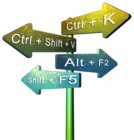
Do you want more keyboard shortcuts?
Explore our PowerPoint Keyboard Shortcuts and Sequences Ebook that is updated for all PowerPoint versions.
By entering your content in the outline mode, you make sure slides use the placeholders and slide layouts properly. This is especially important for proper text flow in your finished presentation.
Add Meta-Data - Meta-Data increases the accessibility of your presentation by making it easier to find. Click on File, Properties and fill in the blanks. Pay particular attention to keywords. These are the words a search engine will use to find your presentation. Set up a handy reminder by clicking on Tools, Options, go to the Save tab and put a check next to "Prompt for file properties". PowerPoint will automatically open the properties dialog window when you save a new presentation.
Check Readability - The content of your presentation should be clear and simple so that it's easy to understand. Using clear and simple language promotes effective communication. Access to written information can be difficult for people who have cognitive or learning disabilities. Using clear and simple language also benefits people whose first language differs from your own, including those people who communicate primarily in sign language. Avoid using abbreviations and acronyms, if possible. Abbreviations and Acronyms are inconsistent. One person's Meeting (MTG) could be another person's Mortgage (MTG).
I prefer to download and install Bullfighter. This add-in for Microsoft Word and PowerPoint is easy to install and use. It's also a lot more fun than the standard PowerPoint spelling and grammar checker. If you choose not to use Bullfighter, save your outline to a Word document and run a more extensive version of the Word spelling and grammar checker. To set it up in Word, hit the F7 key, in the Spelling and Grammar window, click on Options, and check the check grammar with spelling box and the show readability statistics box. Click ok and run the spelling and grammar checker. When complete the readability statistics window opens. By using short paragraphs, sentences and words, reading comprehension of your presentation can be greatly increased. This isn't "dumbing down" your presentation, it's communicating effectively.
To learn more about readability statistics, visit these sites:
Who's Reading Your Writing and
Apply The Design Style - Accessible Design Template choices are affected by two factors; color contrast and font selection. Color blindness (color vision deficiency) is a condition in which certain colors cannot be distinguished. Red/Green color blindness is the most common form and causes problems in distinguishing reds and greens. Another color deficiency Blue/Yellow is rare. Color blindness seems to occur in about 8% - 12% of males of European origin and about one-half of 1% of females. Total color blindness (seeing in only shades of gray) is extremely rare. There is no treatment for color blindness, nor is it usually the cause of any significant disability. However, it can be very frustrating for individuals affected by it. For more information visit the color vision deficiency site.
Fonts should be large and easy to read. Avoid serif fonts such as Times New Roman. Serif fonts look great on paper, but are difficult to read on screen. Instead, stay with common sans serif fonts such Arial and Tahoma.
Change your presentation to Normal View by clicking on Normal View in the lower left corner of your PowerPoint window. Click on Format, Apply Design Template and choose a template with high contrast between the background and text. I prefer to avoid light backgrounds because they enhance the effects of screen flicker. Screen flicker at a high enough rate may trigger seizures in some individuals. Check the contrast between the background and text on your presentation by printing a slide to a black and white printer with the grayscale box unchecked. Change your design template and test again if needed.
To change the fonts of your presentation, click on View, Master. Select all the placeholders and change the fonts to Arial or Tahoma. Although later versions of PowerPoint allow you to embed fonts, Arial and Tahoma are already on virtually all PCs. Learn more about creating or customizing templates on the PowerPoint FAQ site.
Non-Text Elements - Non-text elements such as images, charts, tables, AutoShapes, etc. require alternative text. Alternative text (referred to as Alt-text) is text that is attached to the image but hidden from sight. This Alt-text is typically used to provide a narrative description of the item for non-sighted individuals. How to add Alt-text to objects is explained in the add Alt-text section of this tutorial.
Additionally, all items on a slide are read in the order they are added to a slide. This is the text flow mentioned earlier. By entering our titles and text in the outline, we made sure these items would be read first.
Add Graphics, Clip Art, Charts, etc. - Go through your presentation and enhance it with clip art, charts, etc. Add the items in the order you want them to be seen and read on the slide. Keep in mind that any non-text elements need a narrative description. Resist the urge to add unnecessary images. Be selective in your choice of non-text elements. Choose images and items that enhance your slide and make the message clearer. Analogies and metaphors increase the ability to absorb and retain your message, especially in a technical presentation. They provide a "mental bridge" to the content of the presentation. Images that reinforce metaphors of the slide message can be especially effective. Take color contrast into consideration as you did with the presentation design. Avoid animated gif images. The rapid, repetitive motion of animated gif images can be distracting to persons with cognitive issues and may increase screen flicker.
Using Tables - Excerpt from PDF Can Comply With Section 508. Now It's Your Move, by Duff Johnson, published 12-10-2003, www.planetpdf.com: "The Section 508 regulations include two separate provisions on tables - and for good reason. Conceived by and exclusively for sighted users, tables are one of the most difficult content delivery vehicles to make accessible. Imagine removing gridlines and cells to reduce a table to a stream of text, and you will understand why. The Section 508 regulation states that row and column headers be identified. To ensure usability (as opposed to mere compliance), document authors may wish to consider using narratives to deliver information that might otherwise have implied the use of a table."
When using tables in your presentation, you must describe the contents in narrative detail. After adding your table, select it by clicking on the outside border, right click and select ungroup, answer yes when prompted to convert the table to shapes. Right click again and click on grouping, group.
Using AutoShapes - While AutoShapes may appear to be images, they are actually text boxes. AutoShapes include squares, rectangles, circles, stars, call-outs, etc. Screen readers will read the text contained within the AutoShape. They may or may not read the alt-text associated with the shape. If you add text inside your AutoShapes, make sure the words are relevant and make sense.
Including Media - Avoid using media in a presentation to be posted on the web. Most media files are not integrated into the presentation file and require a separate Download. Media files also do not convert well to other formats such as text-only and PDF. If you are distributing your presentation on CD, media files are more acceptable and accessible. See How to create a presentation for distribution on CD on the PPTFAQ site for more information about distributing presentations on CD. If you do decide to use media in your presentation, follow these guidelines:
Providing a transcript of the audio portion of a multimedia clip is not acceptable. The reader must be able to read the caption as the video is playing.
Learn more about captioning multimedia at this site: Captioning Overview and Tutorial.
Add Alt-Text - Right click on the first non-text object, click on Format, click on the Web Tab (skip this step for PPT 97) and enter the alternative text for this object. Imagine describing the object to someone over the telephone. Enter how you would describe it. Repeat this for all non-text objects in the entire presentation.
Check The Object Order - Items on a slide are read in the order that they are added to the slide. If you have any slides that you're unsure about the order, use the Tab key in the slide view. Each press of the tab key selects the next shape in sequence. The tile and text should be the first items listed. If any of your objects are not in the desired order, use the Draw, Order commands to move them forward and backward in the stacking order. For an even easier solution, the PPTools Starter Set Plus includes a layer manager that allows you to easily redefine object layering.
Set Screen Tips For Links - PowerPoint links give you the option of adding a descriptive caption. This is much more effective than having the reader see a long URL. To add screen tips to your links, highlight the link, hit the CTRL-K key, click on the screen tip button and enter a meaningful short description of the link.
Set Up The Slide Show - By default, PowerPoint allows the reader to advance through slides using the enter key, space bar, mouse click, etc. This is a boon for persons with mobility issues. Avoid using the browsed by an individual mode when setting up your slide show. This restricts the advancement of slides to links that you include in the slides. Avoid modifying slide transitions in such a way that it will hamper someone with mobility or cognitive limitations. Try not to automatically advance slides since some persons may not have enough time to absorb the information.
Size Matters - Bigger is not always better, especially when viewing files over the web. PowerPoint files can quickly "bloat" as you add and delete items. Your presentation may not be accessible if it's too large. It may be difficult to Download for persons with slower connections. Images and sound files can add a lot of unnecessary weight to your files. Use them prudently and only when they add value. Visit the PPT FAQ Site for information about decreasing the size of your presentation. NXPowerLite and RnR PPTools Optimizer are personal favorites for optimizing images in presentations.
Run the Accessibility Wizard - Download the Accessible Web Publishing Wizard for Microsoft Office. Run the wizard by clicking on File, Save As Accessible Web Page. Follow the prompts to alter or expand the alt-text for your images. Experiment with other features of the accessibility wizard to decide which work best for you. The most important thing is to label all images appropriately and save at least a text only version. When labeling the images, imagine describing them over the telephone to someone. This is what you should enter for the alt-text.
Test the Presentation - Download PowerTalk. PowerTalk provides a very good approximation of how the presentation will sound with a screen reader. It is also an accessibility tool in it's own right and it's available for free. Please note; PowerTalk requires PowerPoint 2000 or higher to work properly. Run the presentation using PowerTalk and listen carefully to the flow of your presentation.
If you're fortunate enough to have Adobe Acrobat, convert the presentation to a PDF file. Using Adobe, save the PDF file as an RTF (Rich Text Format) file and use the Read Aloud feature to verify text flow. Find out more about Adobe Acrobat and Accessibility at the Adobe Accessibility page.
BackYou May Also Like: PowerPoint Accessibility | STAMP - Accessibility Add-in for PowerPoint

Microsoft and the Office logo are trademarks or registered trademarks of Microsoft Corporation in the United States and/or other countries.