Indezine Logo


Can I Get a Better Green?

Learn how you can change the tints and shades of colors that show up within the Theme color galleries throughout the PowerPoint interface.


Author:

Product/Version: PowerPoint


Our thoughts are all influenced by color. An apple that's the right shade of red seems so much more appealing than another apple where the color red looks a little dull. But you still haven’t eaten that apple! So how do you know which one is tastier? Turns out that it doesn't matter at all, because color drives our perceptions and choices in many ways!

Unlike the color of an apple that you cannot change that easily, you'll find great satisfaction in changing some colors within your presentation's color palette, especially those over-saturated ones! And if you imagined that changing some of these colors was not possible, then learn more from this article I co-authored with Julie Terberg. This technique makes results so easy to achieve, and you end up with colors that look more appealing—to you and to your audiences.

Thanks to Julie, without whose help this article would not have been possible.

- Geetesh Bajaj

Theme colors are an integral part of a PowerPoint template. These colors appear in all of the Ribbon galleries and will influence the look of graphics and charts created with the template. When developing a corporate template, these colors should be defined to match brand standards. It's important to adhere to a common palette for all corporate materials to maintain the brand and present a consistent appearance.

Those brand-specified RGB values might work fine for the primary Theme colors that appear in the top row of the Theme Colors gallery (pointed in red in Figure 1, below). But what about the tints and shades (pointed in blue within Figure 1) that populate the rest of the gallery? PowerPoint automatically generates these values based on Theme colors. You cannot manually set any of the tints or shades. You’ve probably seen a few tints that were so bright that they hurt your eyes! How can you adjust these screamingly intense tints so the full color palette is usable?
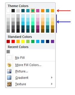
Theme Colors, along with their tints and shades
Figure 1: Theme Colors, along with their tints and shades

Of the 16.7 million color combinations available in the RGB model, our eyes can only distinguish about 60% of that number (still an impressive 10 million colors). What this means for you and me is that some of the RGB color combinations will appear exactly the same. You can take advantage of this discrepancy when adjusting your Theme colors. By changing some values in the color model, you can visually match the original theme color and improve the resulting PowerPoint tint colors. Seems impossible? Don’t worry, we’ll show you how it’s done.

Figure 2 shows a sample Theme Color gallery with a red arrow pointing to a super bright tint color. This is a result of the high saturation value of the original green Theme color.
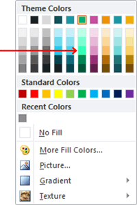
Theme Color gallery
Figure 2: Theme Color gallery

We'll demonstrate how to adjust color values using this green as an example:

  1. Begin by drawing a rectangle on a slide. Set attributes to no outline. Your shape may look like what you see in Figure 3.
  2. Rectangle shape
    Figure 3: Rectangle shape
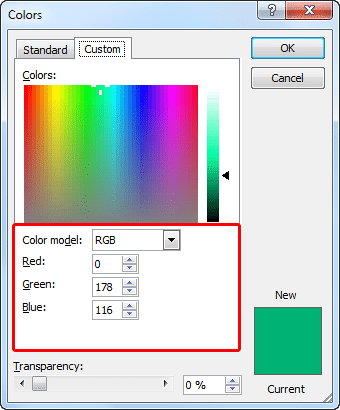
  3. With the rectangle selected, click the Shape Fill button on the Ribbon and then select More Fill Colors. Change the fill color of the rectangle using the RGB values for our green color (highlighted in red within Figure 4):
  4. Red 0
    Green 178
    Blue 116
  5. RGB values
    Figure 4: RGB values
  6. Click OK to accept the color changes.
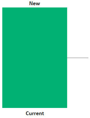
  7. Copy the rectangle and paste a duplicate directly above the original (without space in between) to make it easier to compare both the Current and New colors (see Figure 5). We made these rectangles fairly large because after making color adjustments, the zoomed in areas of these large rectangles will allow far more accurate matching (and comparison).
  8. Original versus new theme colors
    Figure 5: Duplicate your rectangle
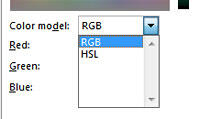
  9. Select the duplicate rectangle, then access the same Colors dialog box, as shown in Figure 4, above. By default, this dialog box displays the RGB color model (see Figure 4 again). Click the arrow to the right of RGB to switch to the HSL color model (see Figure 6).
  10. Change from the RGB to the HSL color model
    Figure 6: Change from the RGB to the HSL color model
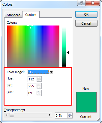
  11. Note that the green color remains the same. Only the color model and the values will change. Notice in Figure 7 that the saturation (Sat) value for this green is set to 255. This is the highest value you can define for any of the attributes in either color model. All values can range from 0 to 255.
  12. HSL values
    Figure 7: HSL values
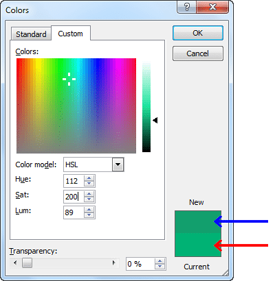
  13. Reduce the Sat value to 200. You will see the result in the lower right corner of the Color dialog. The New color chip (pointed with a blue arrow within Figure 8) becomes darker than the Current color (pointed with a red arrow).
  14. Saturation(Sat) value set to 200
    Figure 8: Saturation(Sat) value set to 200
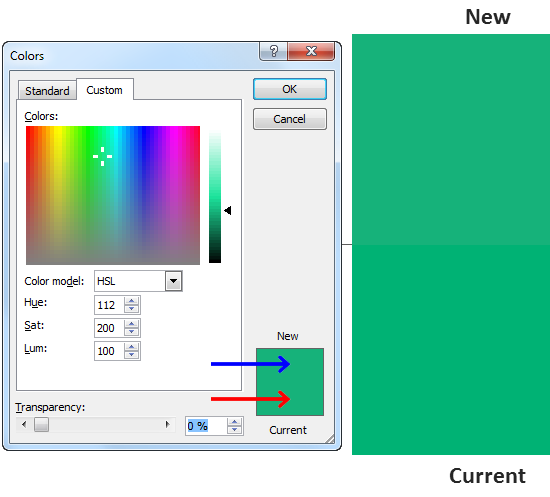
  15. Since our objective is to visually match the Current color, the next logical step is to increase the brightness, or luminance (Lum ). Increase the Lum value to 100. The color chips in the lower right corner appear the same, but upon close inspection the new color has just a hint of blue (see Figure 9).
  16. Luminance (Lum) value set to 100
    Figure 9: Luminance (Lum) value set to 100
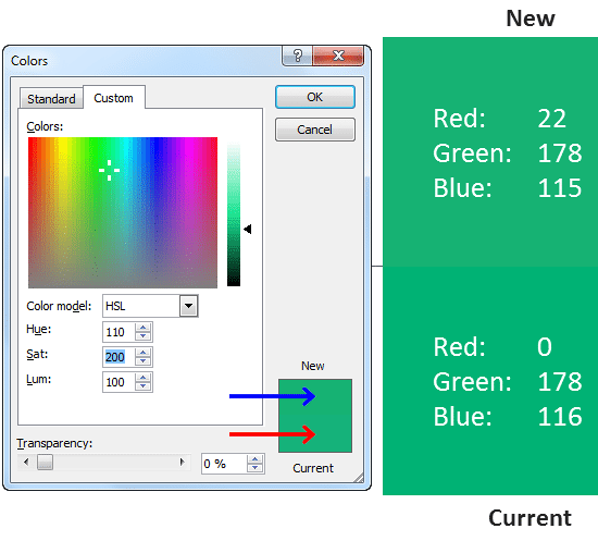
  17. Similarly, change the Hue value to 110, just a hint back toward green (see Figure 10).
  18. Hue value set to 110
    Figure 10: Hue value set to 110
  19. Figure 10 also shows the final HSL values for the new green (in the Color dialog) along with the RGB values for both new and original (in the larger rectangles on the slide). As you can see, it is possible to have two different sets of RGB values for identically-appearing colors.

Although these colors appear similar to the human eye, they are not necessarily the same. You will find that this change of color values results in better tint and shade colors in the Theme Colors gallery! Figure 11 below shows a side-by-side comparison of the original versus new Theme color, and the resulting tints and shades. The screaming bright tint on the left is replaced with a subtle light green on the right, a more palatable color for presentations.
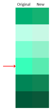
Original versus new theme colors
Figure 11: Original versus new theme colors

Now that you understand how to adjust your colors, it’s your turn. Work on a backup file to determine your new, lower saturation color values. Use the new values to edit your existing theme colors. If the tints are still too hot, try the process again with lower saturation. Be sure to check all colors and tints on various monitors and projectors, as each device can display color slightly differently.

If someone else insists that you must use the exact RGB values as specified, show them this article along with any problem colors and tints in your current theme. And then show them your adjusted Theme colors and the improved tints that resulted from your efforts!


Geetesh Bajaj (Glossary Page)

You May Also Like: Complex Data-driven PowerPoint Dashboard | What You Need to Know About Leadership Before Becoming a Leader


Popular Posts

Character Spacing in PowerPoint 2013
Explore Character Spacing options in PowerPoint 2013.

Add Secondary Value Axis to Charts in PowerPoint 2013 for Windows
Learn how to add a Secondary Value axis to charts in PowerPoint 2013 for Windows.

Ten Easy Topics for Pecha Kucha
But what are simple topics, that excite you, and are interesting to your audiences? Of course, if you already have a topic, you need not read further, but if you are still looking for ideas, here are ten easy topics that you can use for your Pecha Kucha presentations.

Drawing Arcs in PowerPoint
Explore how you can draw an Arc shape in PowerPoint.


Pictures in Presentations

Is a picture is worth a thousand words? You probably have heard this adage so often that we decided not to repeat this phrase throughout this book! Now here’s some more info: the human brain uses a larger part of its area to store visual information rather than textual content. And that’s possibly because a picture describes so much more than text.

Go and get a copy of our Pictures in Presentations ebook.


Microsoft and the Office logo are trademarks or registered trademarks of Microsoft Corporation in the United States and/or other countries.

Home | PowerPoint | Photoshop | PowerPoint Templates | PowerPoint Tutorials | Blog | Notes | Ezine | Media Kit | Feedback | Site Map | About Us | Contact Us

Link to Us | Privacy | Testimonials

PowerPoint Backgrounds | Christian PowerPoint Backgrounds | Business PowerPoint Presentation Templates

Plagiarism will be detected by Copyscape

©2000-2023, . All rights reserved.