Robert Lane and Dr. Stephen Kosslyn look at ideas to reduce text content on slides. They wonder if anyone reads all that text.
Author: Robert Lane and Dr. Stephen Kosslyn
Product/Version: PowerPoint
Does Anyone Really Read All That Text?
The Problem Is No Secret
Becoming More Visual
Physical Form
 Robert Lane is a presentation design consultant specializing in visually interactive communication techniques and is the primary contact person for this article. References, visual examples, and additional resources are available here on the Aspire Web site.
 Dr. Stephen Kosslyn chairs the Department of Psychology at Harvard University. His 35 years of research have focused on how the brain recalls visual stimuli in the form of mental imagery and how psychology can be used to facilitate visual communication.
“Oh, no, not again! Don’t tell me I have to sit through another boring meeting staring at line after line of text on a wall,” she mumbled. “Why can’t these people learn how to make their PowerPoint presentations more interesting?” We’ve all wondered the same thing, but monotonously bullet-pointed, text-filled slides continue to be the norm in most presentation venues. Be different: Show, don't tell.
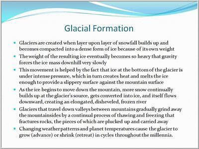
There you are, staring at a PowerPoint slide stuffed full of enough reading material to last three days. You wonder: “Does anyone actually read all this stuff? Does anyone read even a fraction of it? How many people politely sit through these bullet-pointed performances with eyes glazed over, pretending to pay attention?" Even worse, if the presenter reads the slide aloud, why does he bother showing all that text in the first place? Trying to pay attention to his words and read at the same time is more than just annoying—it’s downright frustrating. Sound familiar?

Figure 1: Typical Bullet Point Slide
Sure, text-based slides are easy to create, but let’s face it: they are deadly to watch and clearly offensive to some viewers. The common reaction is: “If you’re too lazy to do anything besides type words on slides … geez, give me your notes, and I’ll read them over a glass of wine back at the hotel bar. Either show me something more interesting or black out the projector and just talk.”
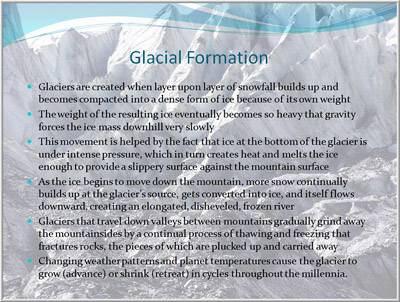
BackUsually, we speakers want to be more interesting—and visual—but how? Some of us compensate by pumping up the visual stimulation. All the text stays in place, but, by gosh, slides get prettier backgrounds, content flies around via fancy animations, and Smart Art diagrams acquire cool-looking bevels and glows. We even search online for clipart that looks like something other than what our five-year-old plasters on the refrigerator, and download slick stock photos of smiling people shaking hands. Surely those will help.
Then, the realization hits. “OK. I think my slides are prettier and my bullet points flop around in twenty different ways, but am I really saying anything in more meaningful, visual ways?” Usually, the answer is a disappointing, “No.”

Figure 2: Bullet Point Slide with Decorative Background
A few brave souls probe bank accounts, hoping to find a couple extra thousand dollars lying around for Photoshop® classes. “No doubt,” they reason, “becoming a graphic artist will improve my visual communication skills.” Months later, they can make ultra-pretty bullet points and morph all those pictures of people shaking hands into dolphins drinking martinis … but visual communication skills remain elusive.
BackWhat does it take, then, to "speak visually" in powerful ways? Sure, having graphic arts talent can be very useful. Understanding design principles is important. Working with pictures, animations, video clips, and attractive layouts … that’s all part of it, too. However, these obvious components are trivial if not used properly. A picture isn't always worth a lot of words; the wrong picture—or even the right picture, but at the wrong time or place—can be worthless, or even harmful. Concepts that guide how visuals should be used in communication are called visual language. Here’s what that term means, along with a few practical suggestions you might try. (Also, download a free visual language PDF guide here)
Any language—spoken, written, or signed—has four key aspects:
BackIn a spoken language, physical form refers to the sounds of words. In a written language it’s the marks on a page or screen. In visual language, physical form is the pictures, animations, and other visual elements of a message that people see. A visual communicator shows imagery carefully just as a speaker articulates words carefully for maximum verbal impact.
The trick here is to make sure that the forms are large enough to be easily recognized, and are easily distinguished from each other, and from the background. Also confirm that the colors are not grating, that contrasts are great enough, and so forth.
It’s at this basic level of visual expression that those design and media skills mentioned earlier do come into play, and are important. Getting the physical form right is equivalent to pronouncing words correctly. If these aspects of visual language are amiss, the entire presentation comes crashing down— the viewers simply won't be able to make heads nor tails of what they are seeing.
Back


Microsoft and the Office logo are trademarks or registered trademarks of Microsoft Corporation in the United States and/or other countries.