The Design Like a Designer Technique: Make Your Presentation Look Professional in Minutes.
Author: Devesh Khanal
Product/Version: PowerPoint
Look at this slide by Bill Gates. What's with the colors? Does it look professional to you?

Image courtesy: Niall Kennedy via Creative Commons License
No!
But look at this mock Starbucks ad. Does it look professional??

Image courtesy: blcklee via Creative Commons license
Yes!
What if all of your presentations looked more like the ad than the ugly slide? What would that do for your job? How much would that help you get noticed and remembered by your bosses, investors, or strategic?
By the end of this post, I'll show you how you can make your slides look like this (or any other) ad, so people will remember you and remember your presentations.
You don't need a graphic design education. You don't need to "be designy" or "be artsy", you don't need to read 15 books on color theory.
You can do it yourself, in minutes.
But first we need to talk about why well designed presentations are important.
A few years ago I was at a startup pitch competition watching the final round. A bunch of startups that sounded the same presented, and their pitches just started blending together: "Our market is huge. We have something really unique. Our team is stellar. We're going to make money really quickly. Blah blah blah…"
I don't even remember any of them.
Then something happened: A teeth whitening company took the stage, and their slides were gorgeous. Minimal text, gorgeous photos, a clean look. Their message came across loud and clear.
They stood out and I listened to every word they said.
Visually, each slide looked like a professional ad in a magazine. I was amazed. How did they do it? Did they hire someone? How long did that take? I still remember certain slides from their presentation today, years later.
That's the power of a well-designed presentation.
Imagine if every time you presented you had that effect. What if your bosses always looked forward to your talks? What if clients and customers remembered your presentations more than anyone else?
It would be awesome.
For the startup that stood out, one of the key things was how visually vibrant their slides were. The color choices were spot on, but they didn't scream or pop out at you. They let you focus on the content. It looked like a designer did it.
How did they do that?
Years later, after designing many presentations for startups and other clients, I've learned that you don't need to get a graphic design degree or read 15 books on design to make presentations that look beautiful and help you get remembered.
You just need to start designing your presentations the way professionals do.
That's what we're going to do today with color.
There's been a lot said about color theory.
But here's the thing with most corporate warriors and entrepreneurs: You don't have the time or patience to teach yourself color theory! You just want to get your ideas across and be as memorable as possible.
That's why I'm introducing…
Now bask in the glory of knowing your slides will look like a designer did them and leave other people jealous.
First, color schemes are not patented. You have the right to use any part of the rainbow because you live on earth.
So why re-invent the wheel for no reason? If a graphic designer for some ad agency picked a color scheme that you think looks good, that's enough!
Second, and this is the most important reason: Picking a professional color scheme from an existing ad limits your choices. When non-designers have too many choices, things look terrible.
Don't believe me?
Remember how MySpace used to dominate social networks and gave users the freedom to design their pages however they liked? This is what happened:
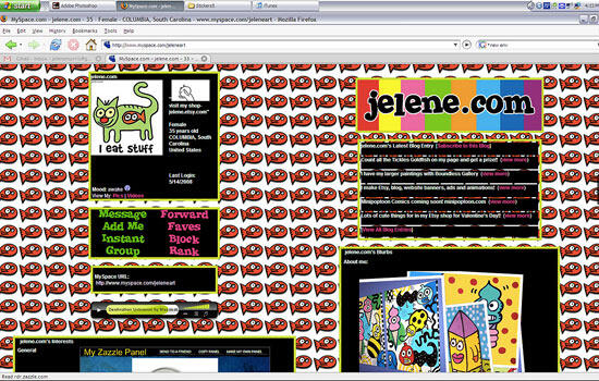
Image courtesy: Jelene Morris via Creative Commons License
Design like this has it's place in the world. But is one of those places your important pitch deck? Likely not.
In contrast, Facebook doesn't let you color your page. The result? Every page is pleasant and professional and you always know where to find information:
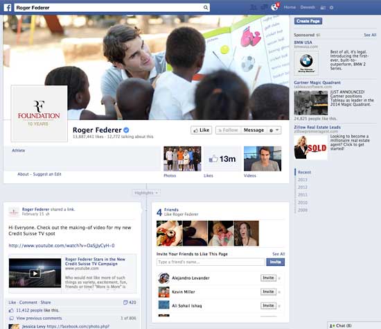
Roger Federer's Facebook page.
How many colors do you see in their scheme? Basically: light blue, dark blue, white, black. Four. Ah, the simplicity.
You can do the same thing for your PowerPoint slides by following my rules above. Let's look at some examples.
Here's a "close enough" slide I made as the starting point for Bill Gates' slide at the top:
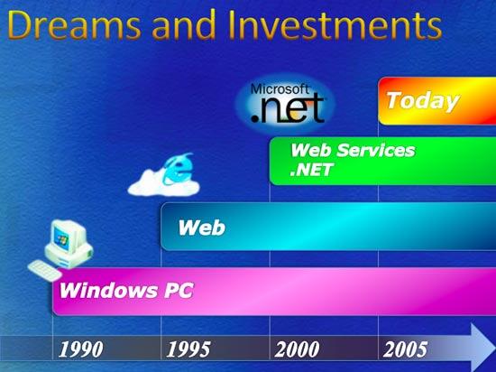
I Googled to find the Starbucks ad at the top. (For this post I had to find a photo with a license that lets me publish the original, but you don't have to do that. Just google "magazine ad".)
It's up to me to pick the two main colors and a highlight. You have some freedom here, so you don't have to be exact. Pick something close, but adjust the shade until it looks good to you on your slide. Don't worry if it's not the exact shade in the ad.
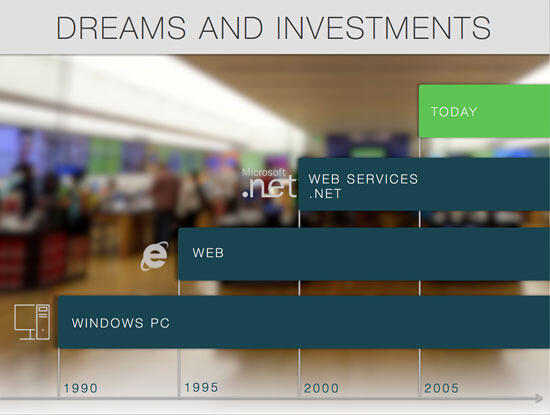
Isn't that better?
But you cheated and did other things too! Like fonts!"
That's correct. But I used the same design like a designer principles as choosing colors: If the Rolex ad folks were making this slide, would they use the cartoons Bill Gates had for icons? No. Would they use a giant block arrow at the bottom? No. Or would they use a random different font for the years? No!
Then why should you?
So pick a font close to the ad you chose and use diagrams you think they would use. You don't have to download a million fonts or draw your own icons in Illustrator, just find something close. You can get tons of icons on Iconfinder, including free ones (I have no affiliation with them).
Here's another example so you can see it's not dependent on the specific ad. The ad is more fun with bolder colors:
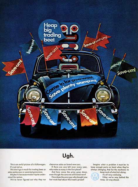
Image courtesy: Daniel Arroyo via Creative Commons License
The slide:
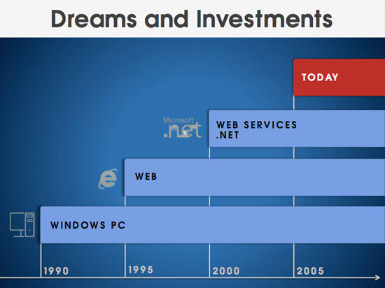
Don't freak out if you're not sure exactly what colors to use where. Just remember this: How would the person that designed the ad do it? And make your best guess. It'll be far better, I promise. If you need to make slight adjustments to make your slide look better, go for it.
This is the power of the design like a designer technique. It will help you pick a color scheme (and font) that looks like a designer designed it (because they did), and ensure you don't have to spend days tweaking colors.
Here's a resource to buy bitcoin.
 Devesh Khanal is a designer and startup guy in the San Francisco Bay Area.
He has a Ph.D. from U.C. Berkeley and helps startups design investor pitches, web and mobile UI, and optimize marketing emails and landing pages.
You May Also Like: NewsPoint: Conversation with Kurt Dupont | Efficient Elements: Conversation with Felix Dollinger


Microsoft and the Office logo are trademarks or registered trademarks of Microsoft Corporation in the United States and/or other countries.